COMPANY
Homely
Year: 2020 - on going (passion project)
Role: UX Designer, UI Designer
Overview
This is my core on-going UX project with the Career Foundry. Tasked in designing an app, I have taken the pandemic as the primary influence in my design thinking process as the research conducted is human centred and focused around the needs of users. The following case study outlines the UX research carried out, defining the problem, ideation and soon enough, validating and testing the prototypes with my target users.
Born out of need
Isolating, shielded and the vulnerable users continue to struggle throughout the pandemic. Required to stay in out of risk to their health and those around them, it is difficult to fulfil basic needs of grocery shopping and retrieval of medication. Now is a time where we must support one another for a better tomorrow. We must take care of those who desperately require assistance and empower individuals for their skills and services throughout this time.
Problem Statement
Government / NHS confirmed vulnerable users and members of the public who feel worried and scared to be outside, need a way to get the personal support they need so that they may obtain their groceries, medication and fulfil home services / jobs to be done by expert professionals.
We will know this to be true when we see users booking services, engaging with the content and completing grocery orders to be delivered.
Research
Other than knowing that our most vulnerable users need assistance, I needed to identify their needs and empathise with what problems they're currently experiencing. There were so many questions that I had, I started to focus in on what it is I knew today and what might delivery the most value for the end user. I came up with the following research goals which would frame my research questions.
Research goals
What have users struggled with during the Pandemic around their needs
To determine which services users have depended on during the Pandemic
Record user pain points and frustrations with existing service-based apps
Document which activities are users needing to complete offline
No. of participants: 8 participants
Where: Due to COVID-19, participants were interviewed through Zoom.
Duration: 30 minutes
Interview questions
What have you found difficult during the pandemic?
How have you been able to obtain your grocery shop?
What would have helped you during the pandemic?
Which services have you been dependent on during the pandemic?
What has surprised you during the pandemic?
What do you feel the impact of the pandemic has had on you?
Considering how the pandemic has changed / compromised our day to day, what do you feel could better your circumstances?
What additional help are you receiving?

Defining the problem
Affinity Mapping
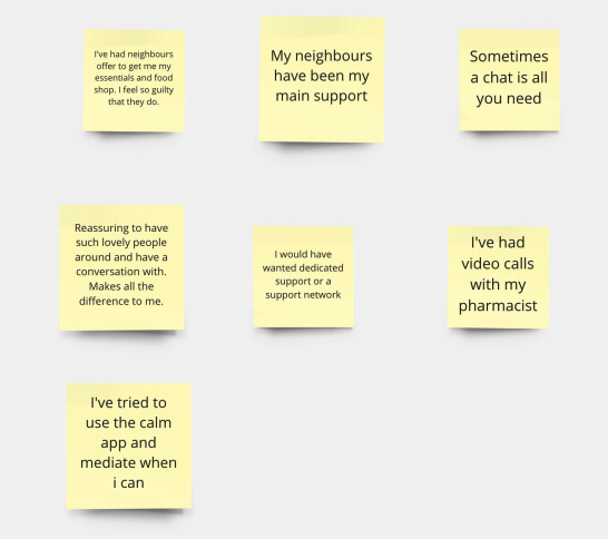
Support
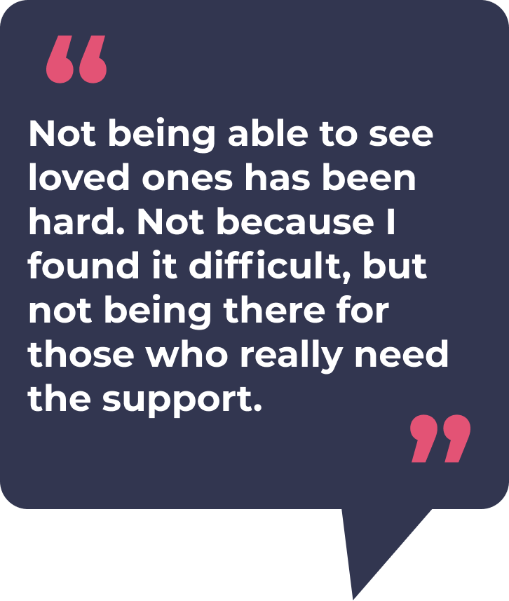
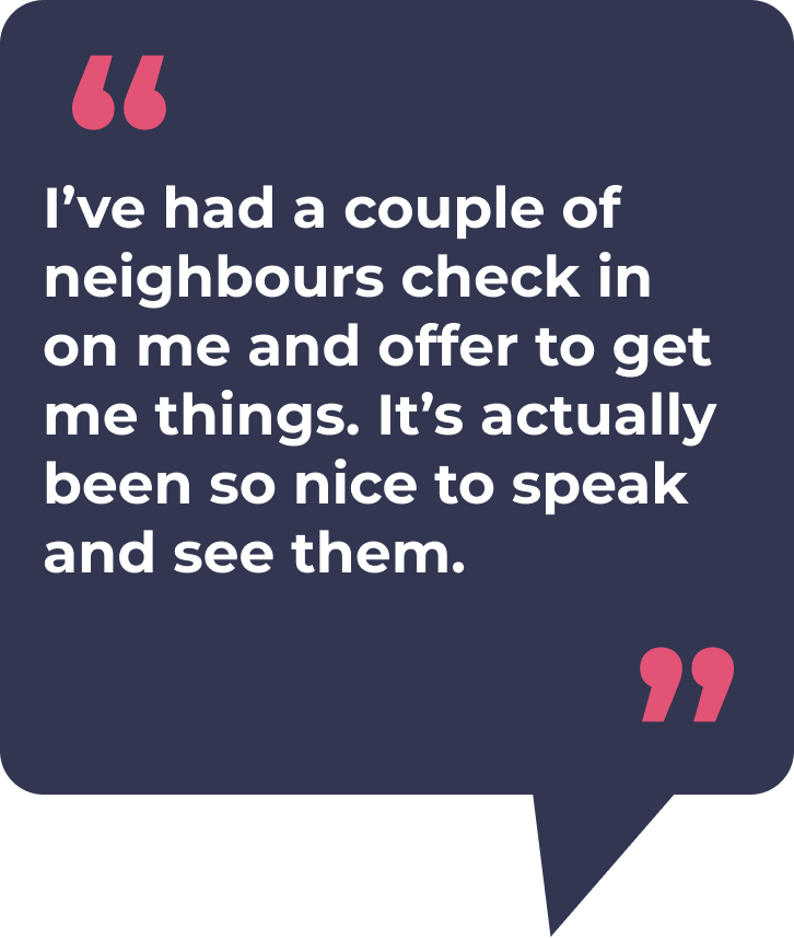
It was clear from the insights obtained that users have received support or are wanting support, but uncertain as to how or what that is. Whilst the pandemic has kept has removed each of us from one another, it has also encouraged us to help those around us from offering to obtain the most essential items to just a conversation. That very need of social contact has been critical, particularly for those who have been considered vulnerable / shielding from the general public.
Hardship
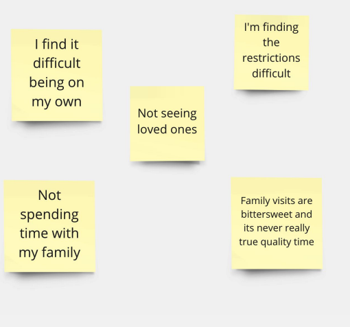
There is a general expression difficulty throughout our interviewees, for themselves and their families. Loneliness and the lack of social contact is what has been highlighted. As those living on their own have limited activities to keep them engaged and busy, there is plenty of room for doubt, negative thoughts and general worry.
Services
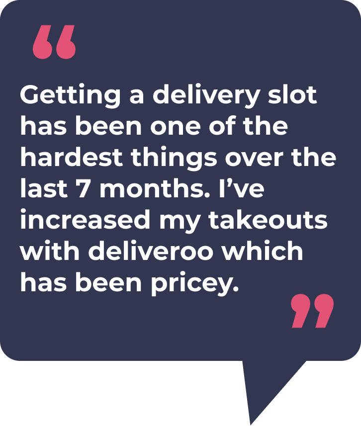
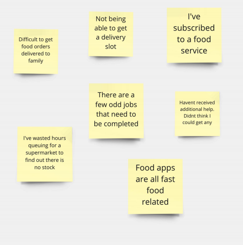
Throughout the pandemic, supermarkets / grocery stores have restricted delivery slots due to customers shopping more than they need to and this has noticeably spiked post government announcements on restrictions to the nation.
Users are encouraged to shop just what they need and reminded there is plenty to go around - whilst this scenario has improved, some supermarket brands have switched off their apps and reduced their services. Not all vulnerable or users who need their groceries are recorded as priority which has compromised confidence in users securing their groceries.
Users have also expressed how they’ve been unable to complete certain home job requirements due to uncertainty or capability
Family worries
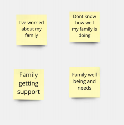
As we continue not being able to see loved ones, users are worrying about their families - are they okay? Are they getting what they need? Are they eating properly? Do they need help? Are people behaving correctly around them? These are some of the questions that the interviewees have expressed as concerns.
Personas
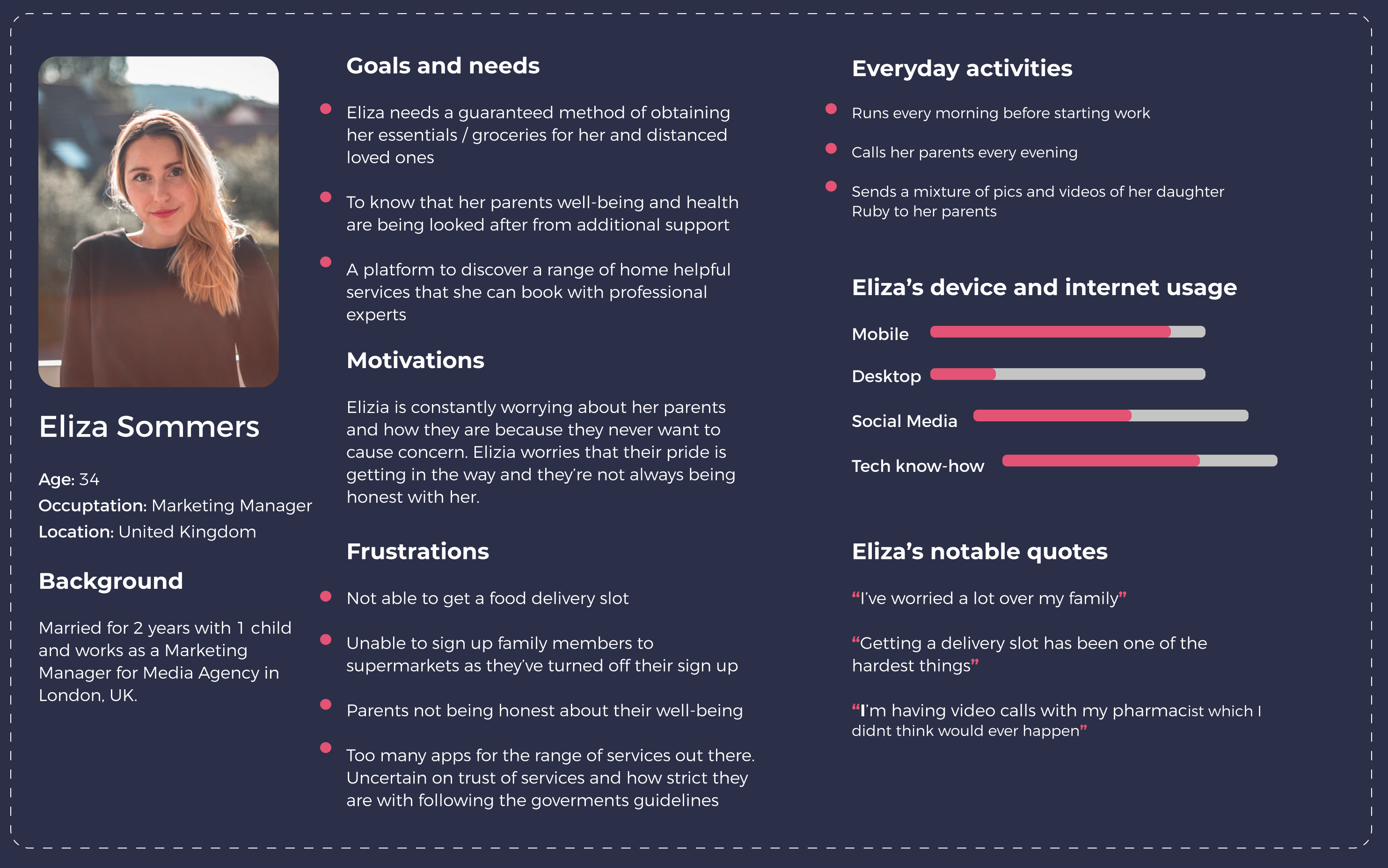
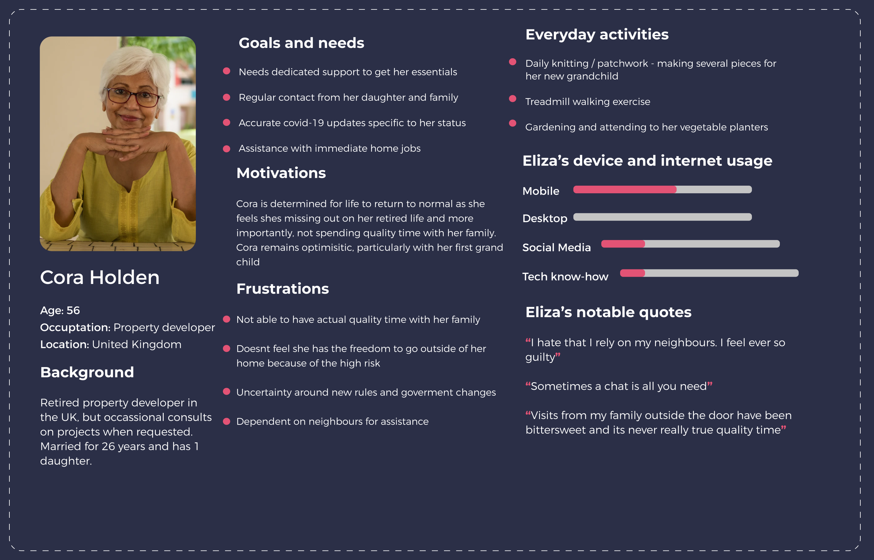
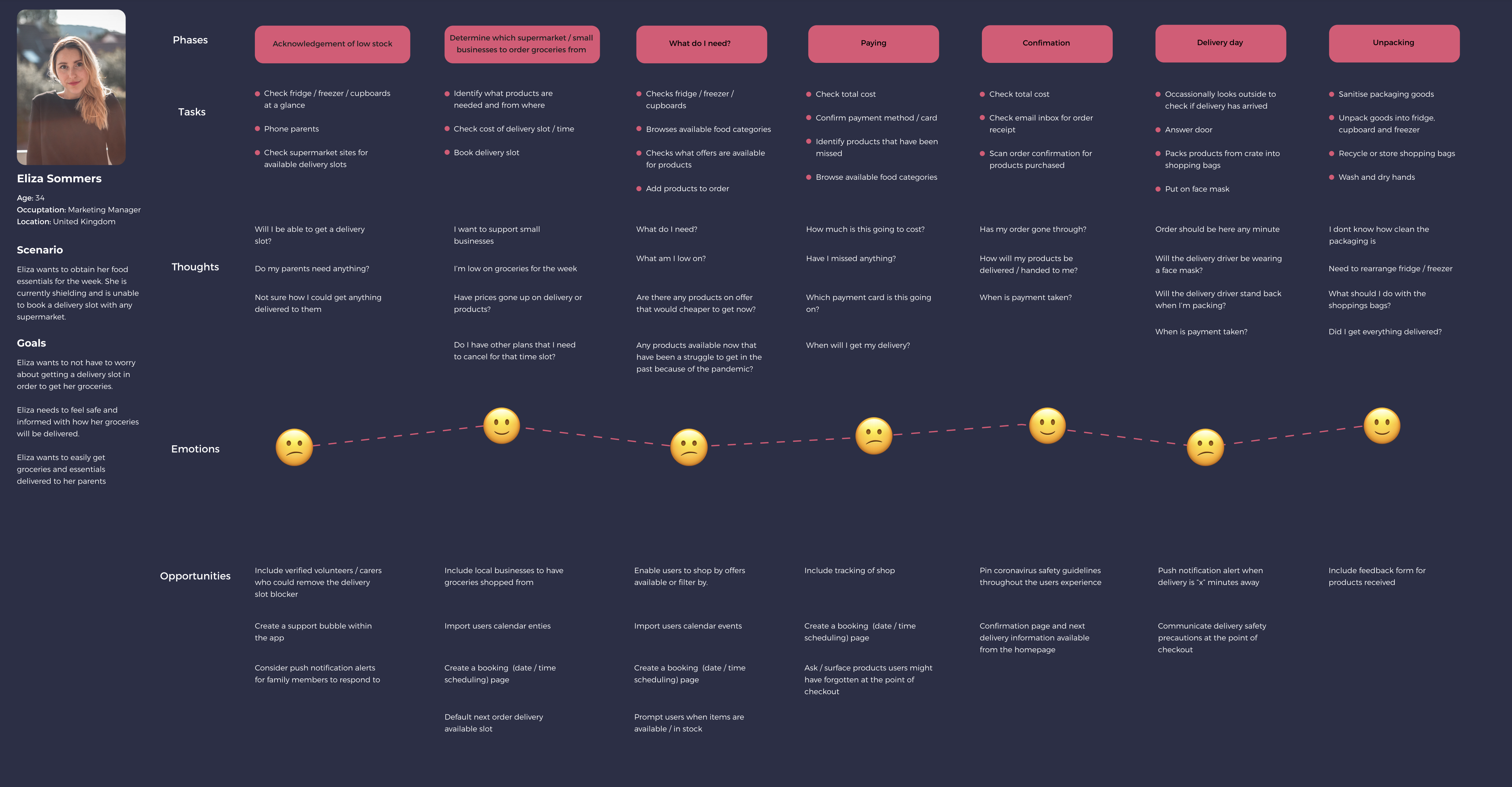
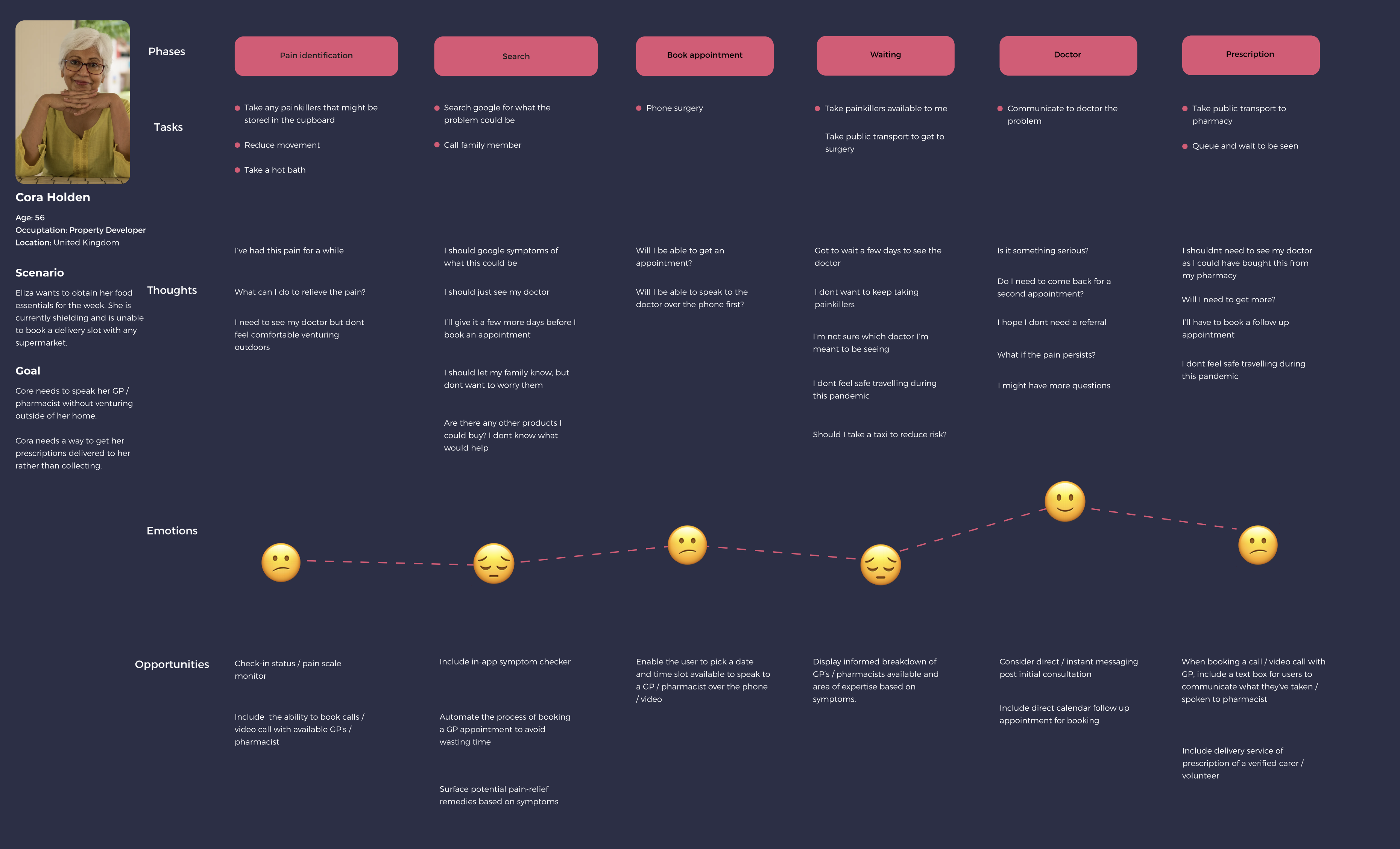
Based on the insights retrieved from the interviews, I was able to translate the research into personas which highlights our users motivations, behaviour and challenges.
User Stories
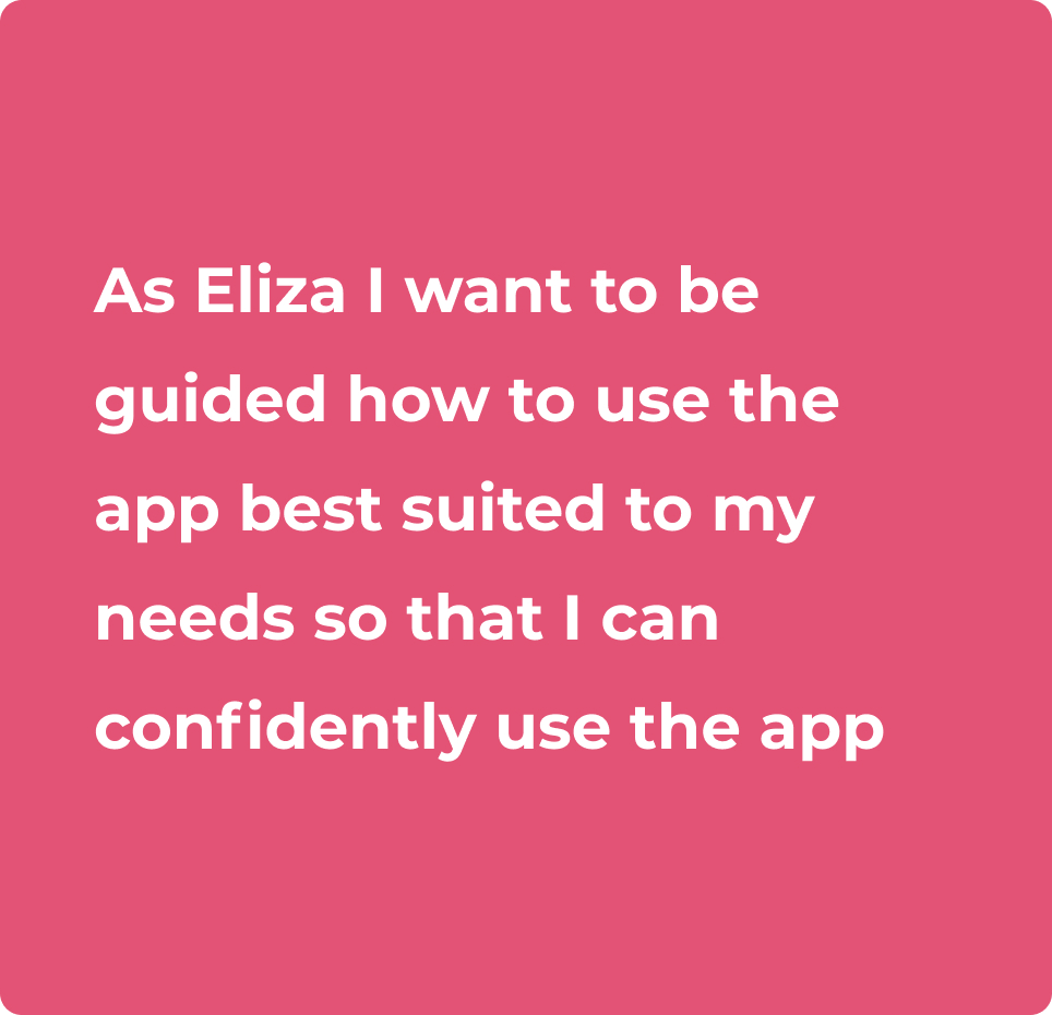
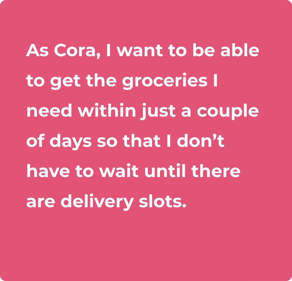
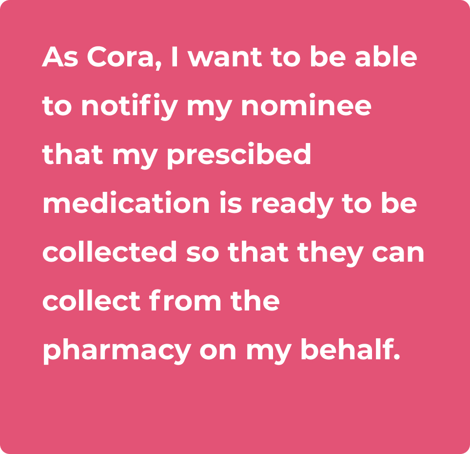
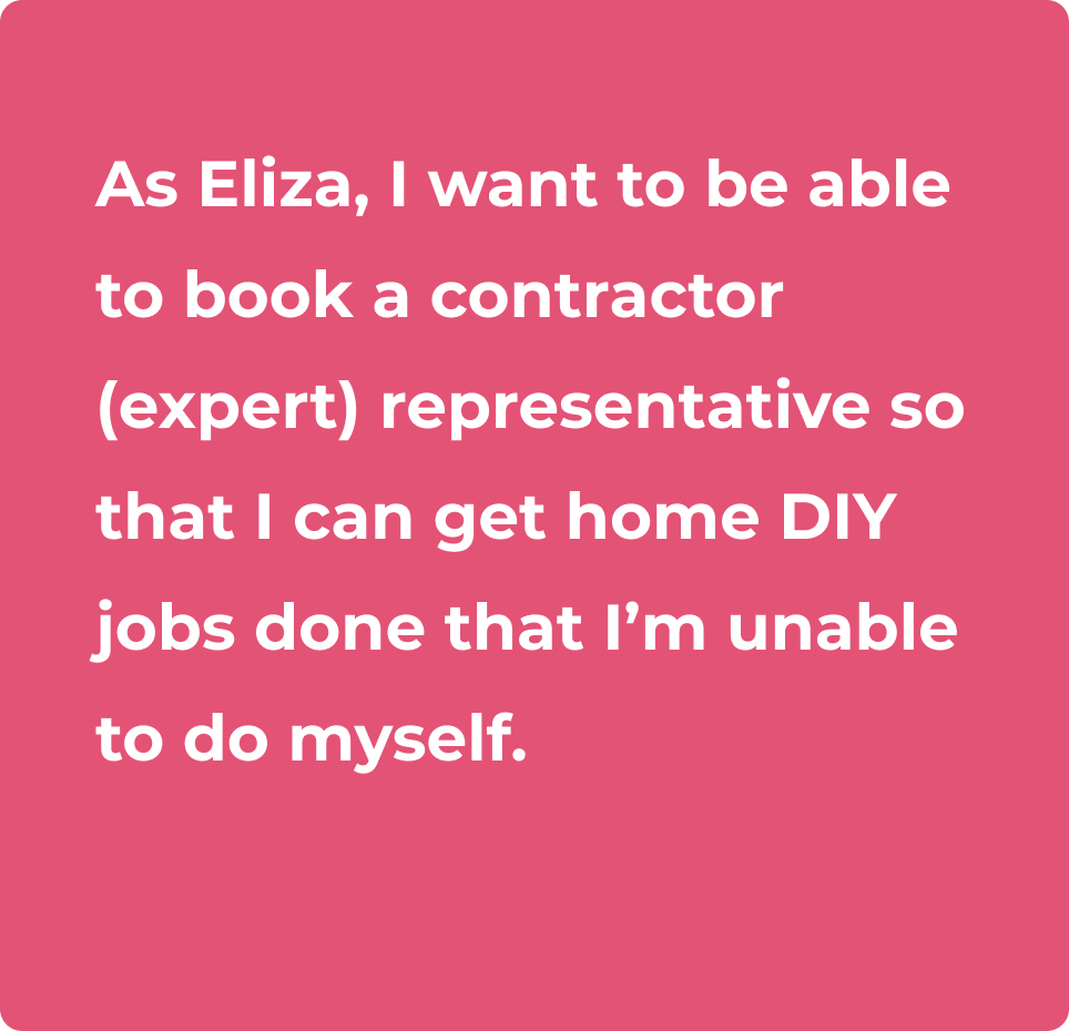
Synthesising both responses and observations obtained from the interviews, I translated the problems into actionable user stories which would enable me to start considering the design based on individual actions the user can take. There are several user stories generated, but I have taken the following 4 as my primary focus for an MVP.
Task Analysis & User Flows
Placing the needs of the user first, I started translating my user stories into tasks and flows to determine which tasks are required to complete the users goal.
In order to the create the task analysis, I set the following questions as my guiding criteria;
- What is it that's prompted my persona to begin the task?
- What will tell the person that their task is finished?
- What information does the persona already know about the process?
- What additional information does the persona need ot know to complete the ask?
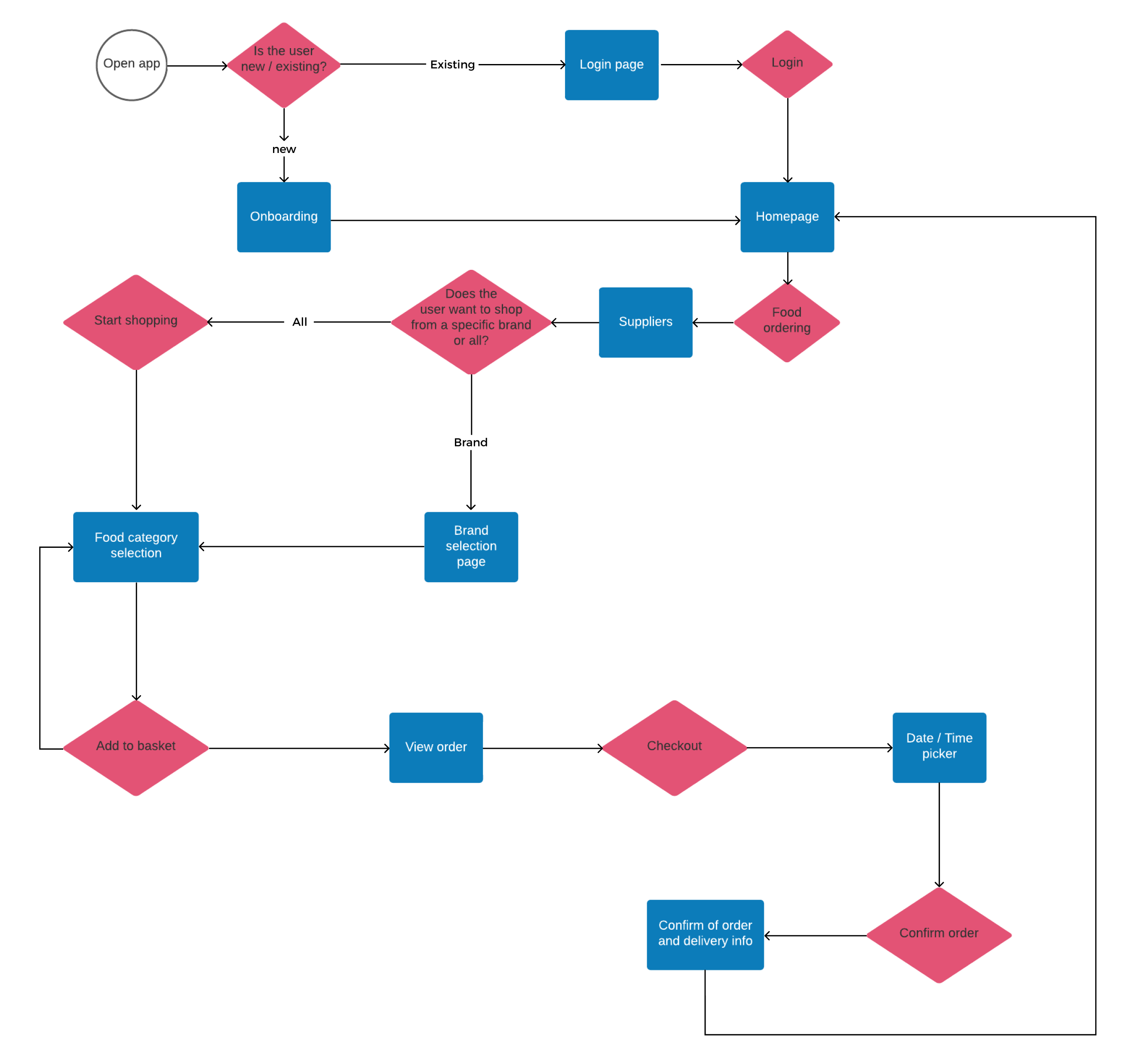
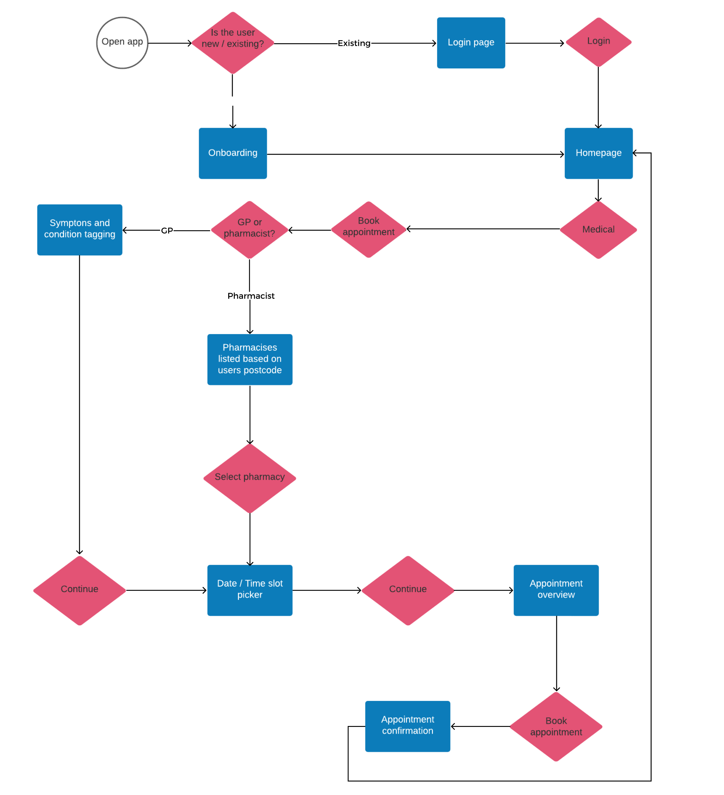
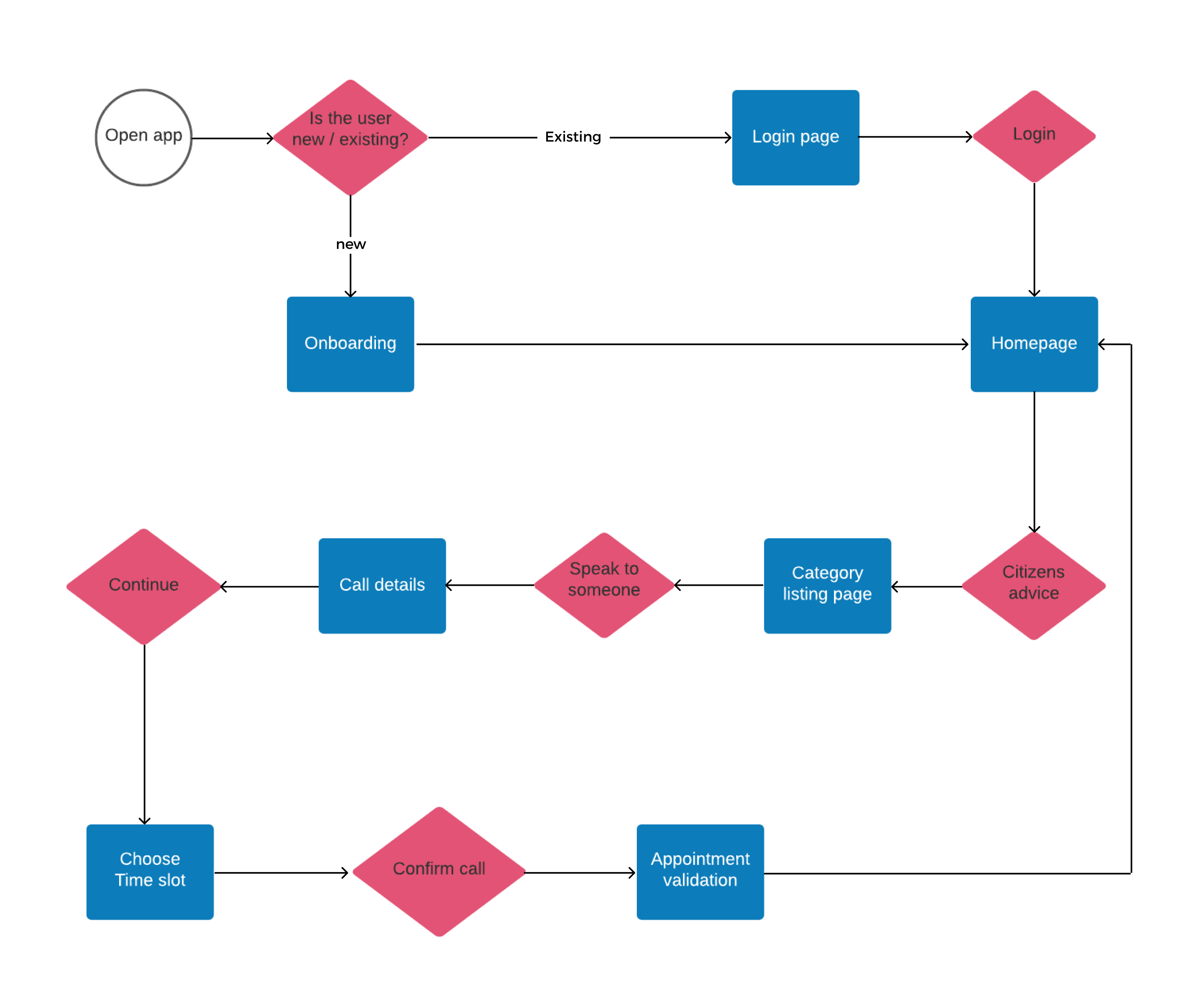
The user flows created based on the task analysis was shaped by the entry point (first encountering the task) and the success criteria (what does success look like).

Task Analysis
1. Log into Homely
2. Select food ordering
3. Shop
4. Add items to basket
5. Checkout
6. Review order
7. Place order
User story
“As Eliza, I want to shop and get delivered groceries that I need from local food markets so that I can support small local businesses that are suffering during this pandemic.”


Task Analysis
1. Log into Homely
2. Select Medical services
3. Book appointment
4. Select time and date
5. Confirm appointment
User Flow
“As Cora, I want to be able to book a call or video call appointment with a GP or pharmacist so that I can avoid travelling and remain shielded during this pandemic”

Task Analysis
1. Log into Homely
2. Select Citizens advice
3. Choose appropriate time slot
4. Confirm the call
User Flow
“As Cora, I want to be able to speak to someone to get legal and accurate advice on the Coronavirus and the implications it has on me so tat I am informed and know what I’m entitled to.”
Information architecture
In order to keep moving forwards, I determined the information architecture (IA) of the app - making assumptions which would need to be tested, but reflects the personas and user flows. I've applied a strict hierarchy as this has its own subpages and requires a "correct path" in order to reach the child subpages. Considering the user personas, we want to avoid our users getting confused or lost as the product will contain various utility functions to assist the user.

Validate the thinking
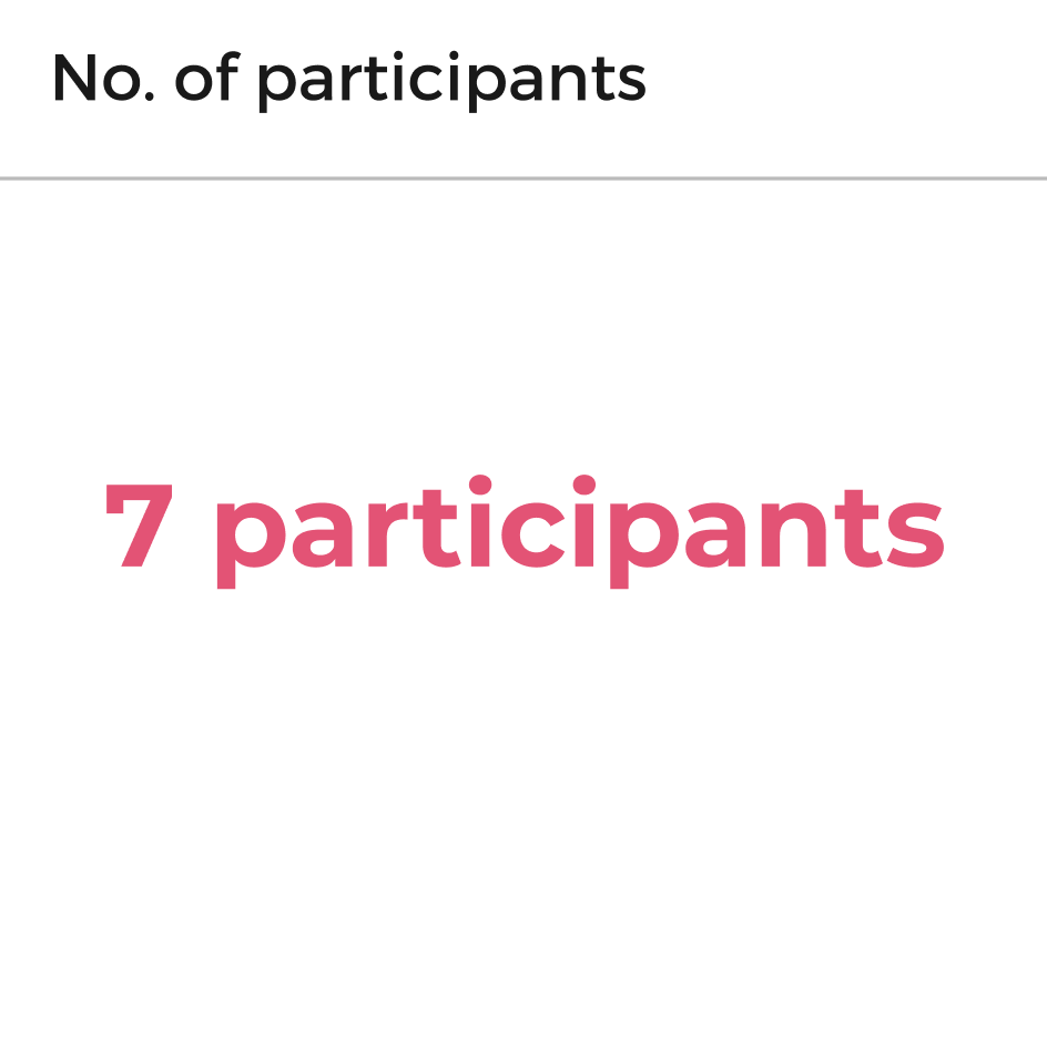
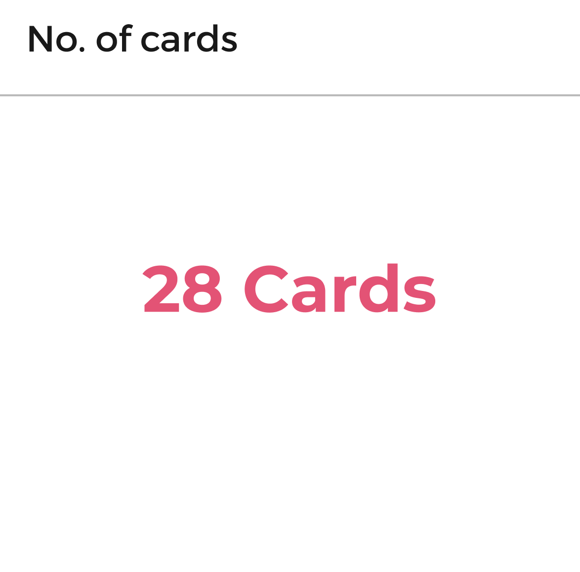
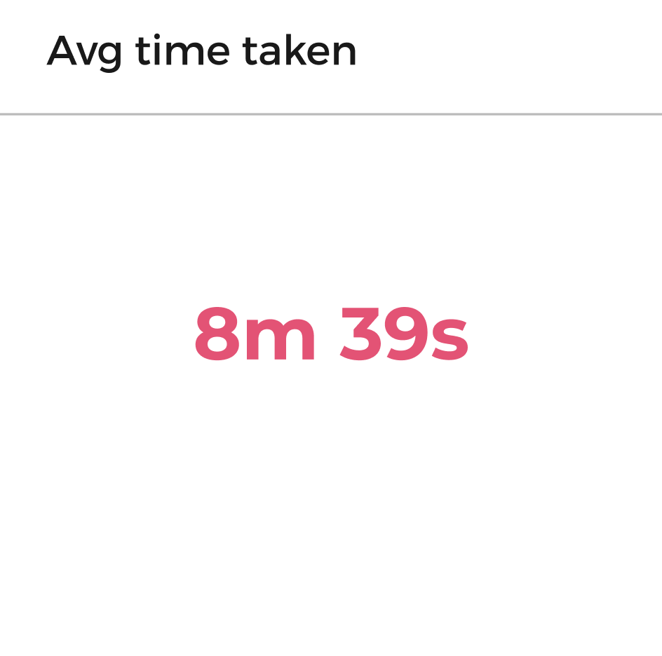
To ensure the IA I've defined is correct, I executed an open card sort to evaluate my assumptions. Given the current pandemic, I used OptimalSort by Optimal Workshop to conduct this remotely.
Account Management
- Add / edit payment card
- Delivery instructions
- Close account
Coronavirus
- Testing
- Test results
- Get a test
- Antibody test
- Test screening questions
- Delivery overview
- Vaccination
- Self isolation and treating symptoms
Next order
- Cancel order
- Contact delivery courier
- Amend order
Book appointment
- Symptoms and conditions
- Pharmacies
- Appointment overview
- Appointment confirmation
Services
- Find pharmacy
- Find dentist
- Find a GP
- Findo ther urgent care services
Home services
- Home cleaning
- Handyman
- Plumbing
- Electrical
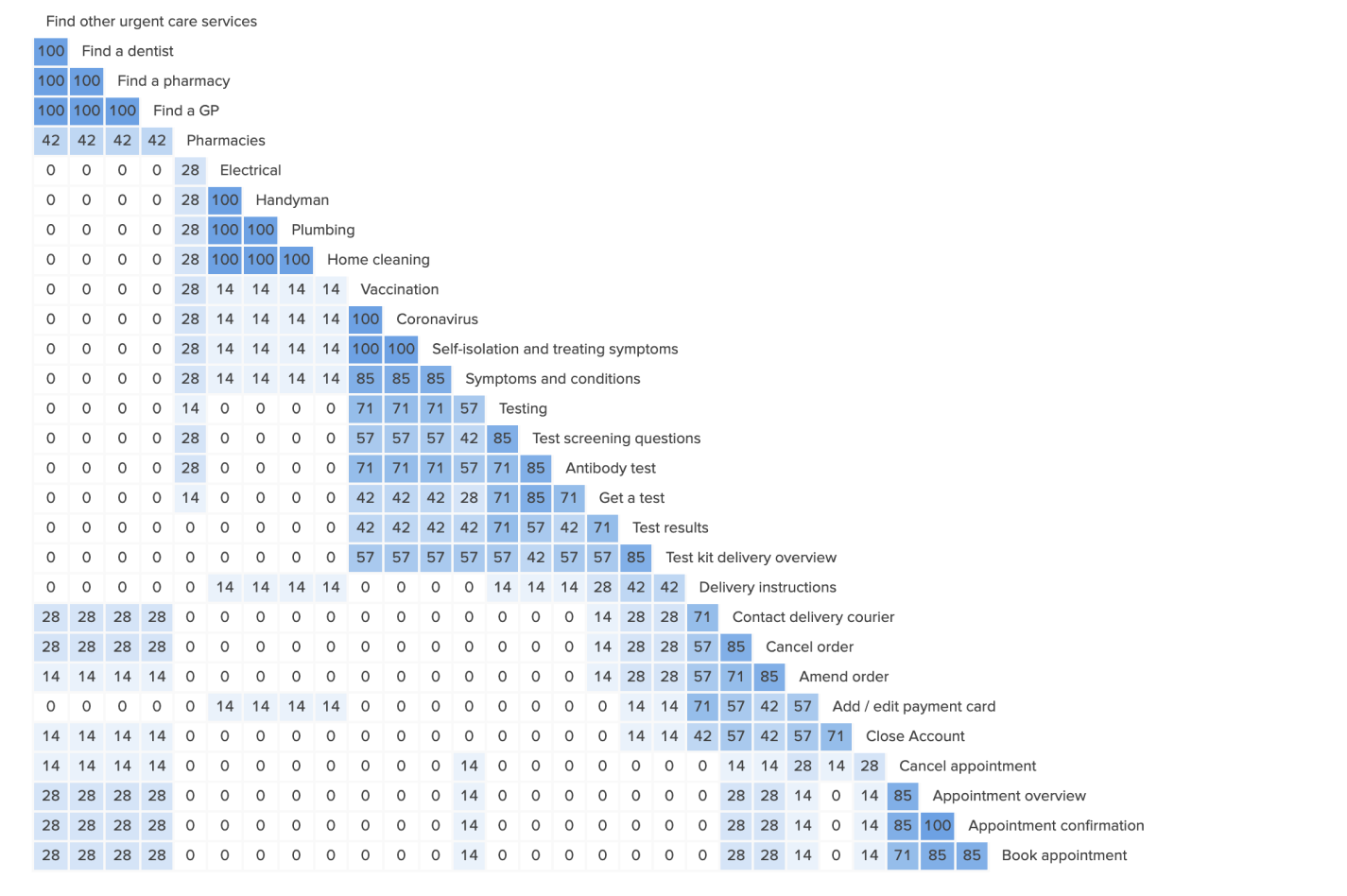
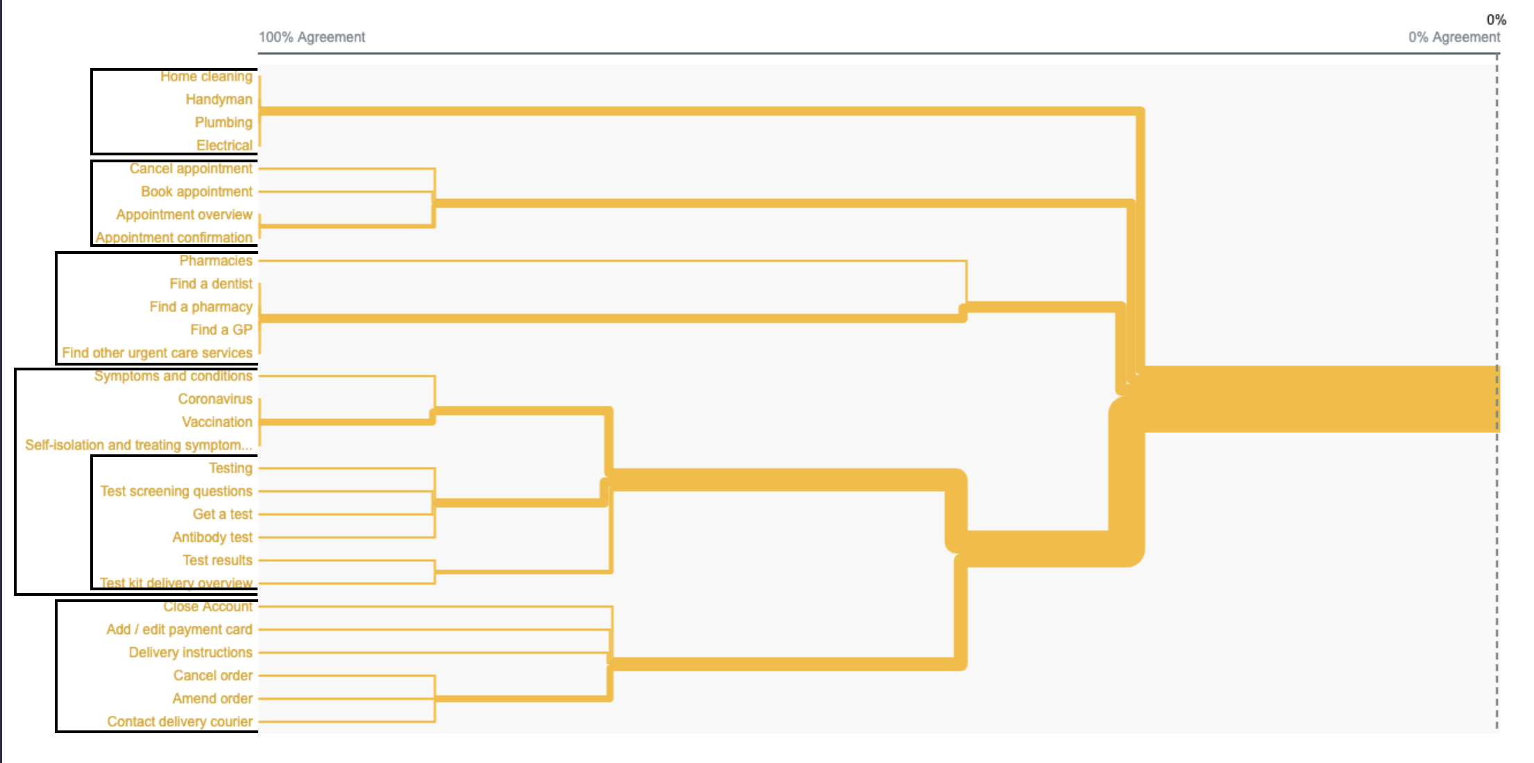
From the research conducted, the sitemap will adapt to the analysis with the biggest changes happening within the medical category. We will explore grouping vaccination and self-isolation and treating symptoms as well as symptoms and conditions - the initial thinking was to enable users to state progressively their reason for booking a GP appointment. However, participants of this study have highlighted the very need to include this for the Coronavirus as well. Consideration will need to be given on what this needs to be in terms of interaction and to have this validated by users as the context of which this sits within is different.
Lastly, whilst participants have grouped associated labels and have highlighted the importance of a slight addition to the Coronavirus section, we want to get to an MVP prototype to better understand whether we ve met users expectations or have compromised their task / goal completion. Category labels renaming based on analysis - (1) Upcoming appointments to My Appointments. (2) Next order to Manager orders.

Ideation
Design requirements
Hand-hold
Not all of our users are going to be confident in using the app as they have little to no familiarity with apps in general. To ensure the experience is as comfortable as possible, each utility / service provided needs to personally guide and communicate with the end user as much as possible. The nature of the app and our user stories is prescriptive and specific to a need which they've not been able to solve without yet.
Action over content
Step away from copy and be descriptive. Get the user taking action - they're here to solve a problem. Let's get away from explaining and take the opportunity to make our call to actions, titles, and primary actions do the work. Dont get in the way.
Be as familiar as possible
Our app has a lot to offer, but not everything is brand new. We're not re-inventing the wheel. Consider those apps which our users are using right now - from groceries, to medical and to contractors. Consider the competition and improve where neccessary.
Knowledge is power
Users are uncertain, worried and scared. Keep it simple by ensuring users are always informed and decisions are validated. How does the design choices made remain true to this. How can we ensure are users always know what's going in at that precise moment.
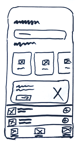
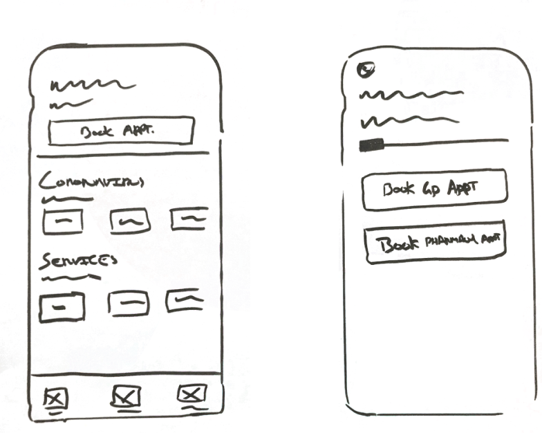
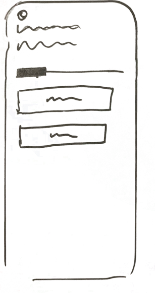
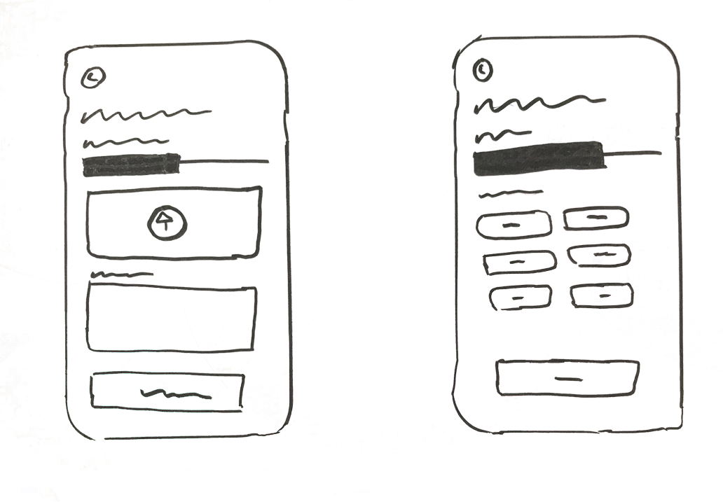
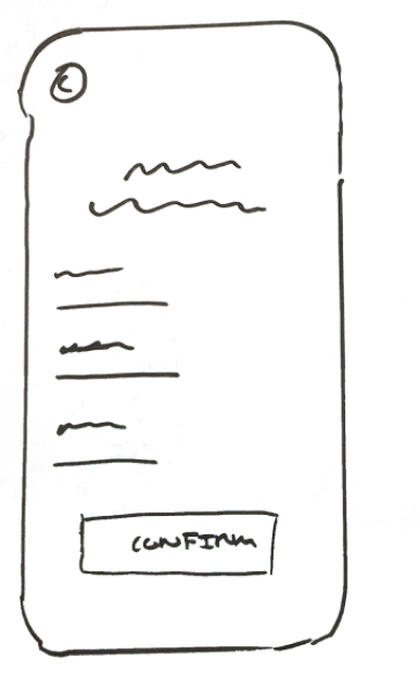
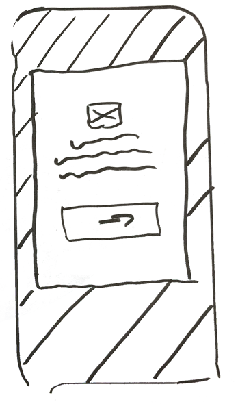
Sketches
I started crafting low-fidelity sketches which aims to highlight only the high-level functionality of the design - purposely glossing over the details of the design and takes only the design requirements, objectives and user stories as influence.
Symptoms checker
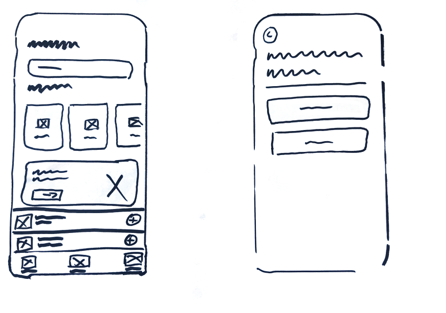
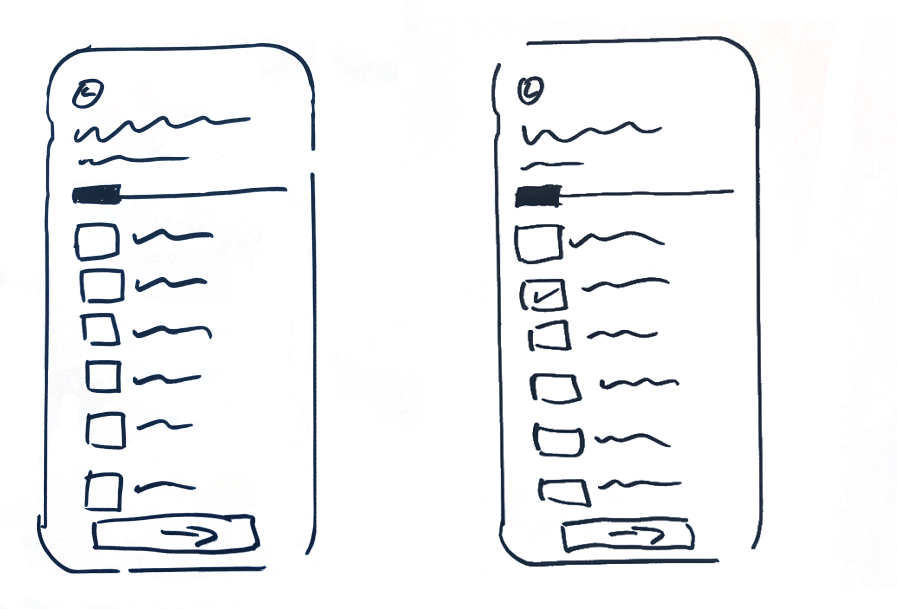
Booking an appointment

Low-fidelity wireframes
Home
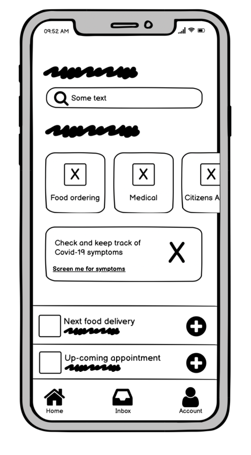
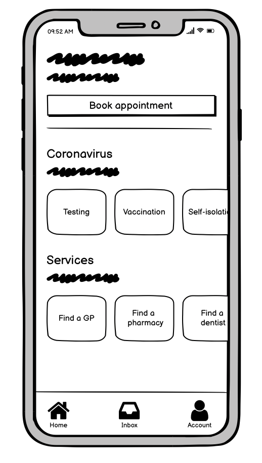
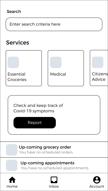
Using Balsamiq, I iterated various home versions of the app. Considering the design requirements set out and the user personas, the home tab provides an opportunity as an entry point to the various services available within the app from the immediate.
Whilst the primary navigation was considered, I kept this free from clutter and define this as the users personal area.
Medical
The medical category remains true to the strict-hierarchy as defined in the IA as it provides a direct link to it's subpages through correct paths only. There's no getting around from one category to another once in it.
Medical - Symptoms / Booking
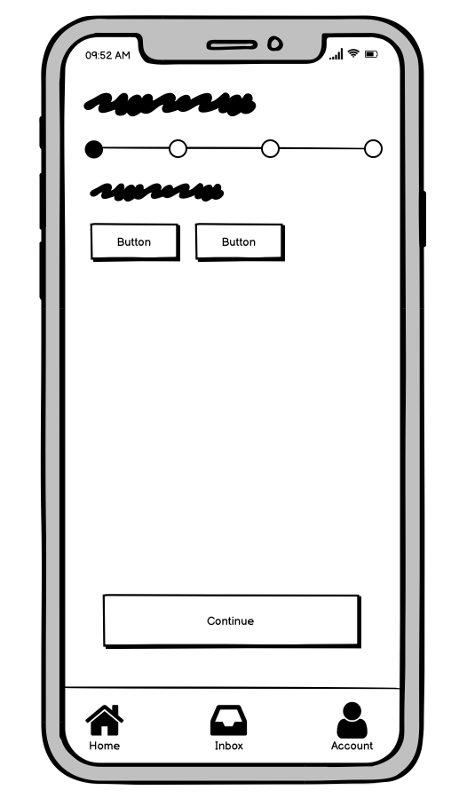
Demonstrated example of applying a progression indicator when navigating through booking an appointment or symptoms checker. User being able able to step back, current stage indicated by the active state.
High-fidelity Wireframes
Whilst my low-fidelity designs are able to communicate the basic user flow and user experience, I started to transition my designs to high-fidelity which aim to include detail and reflection of what the real UI components may potentially look like and start accurately communicating functional behaviour to both developers and stakeholders. Each stage is consistent with minor adjustments when necessary only with no drastic changes / surprises from stage to stage. This continues to consider my user personas as we want to encourage a high and quick adoption rate.
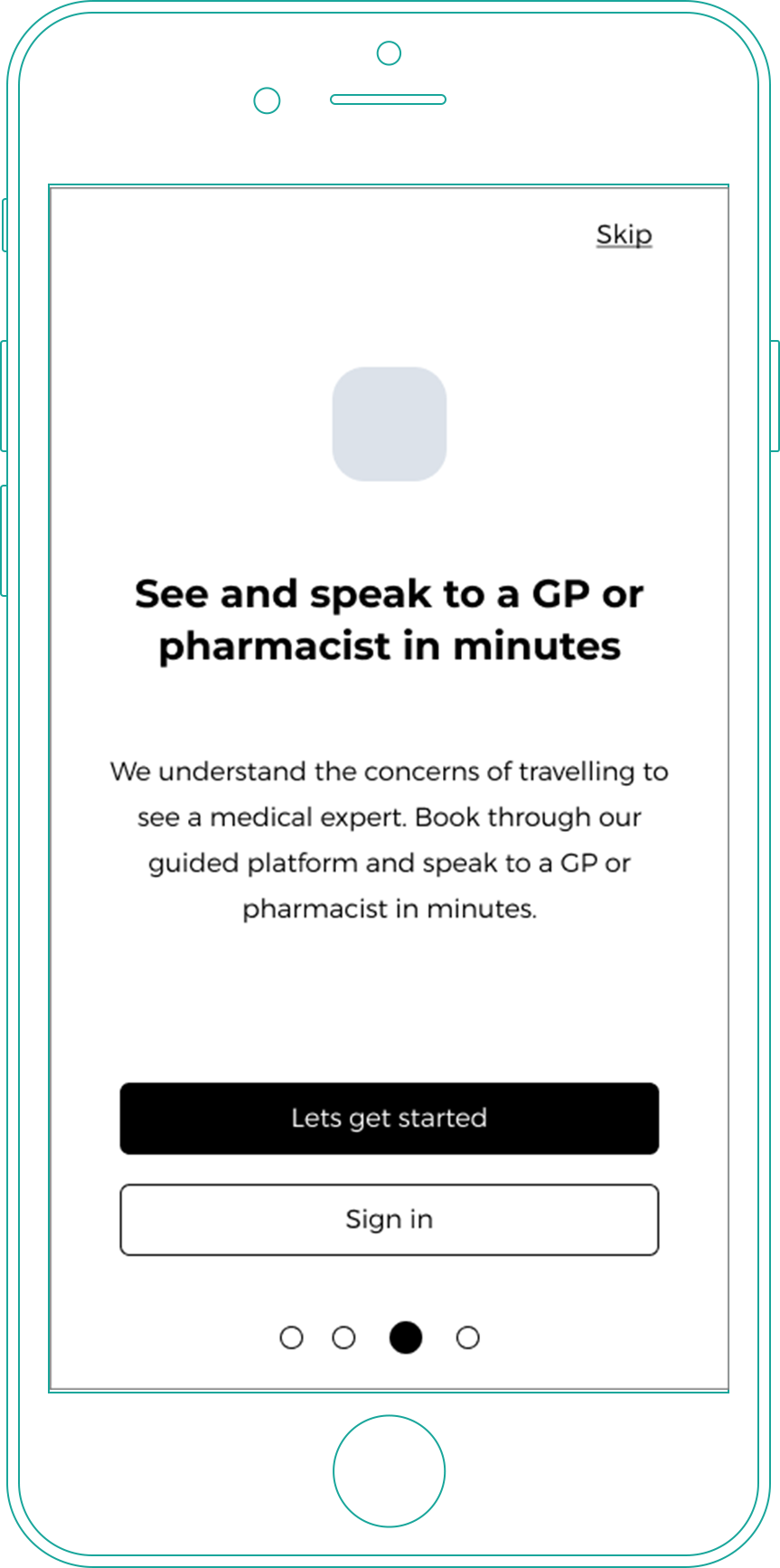
Onboarding our users
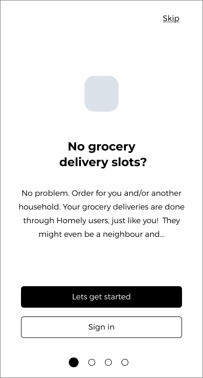
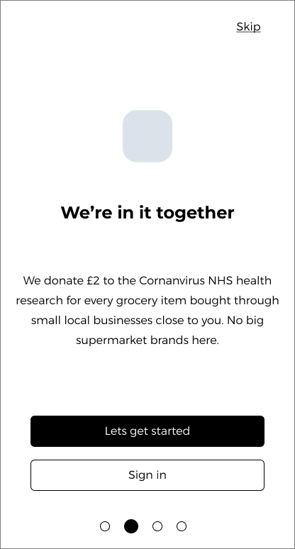
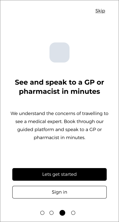
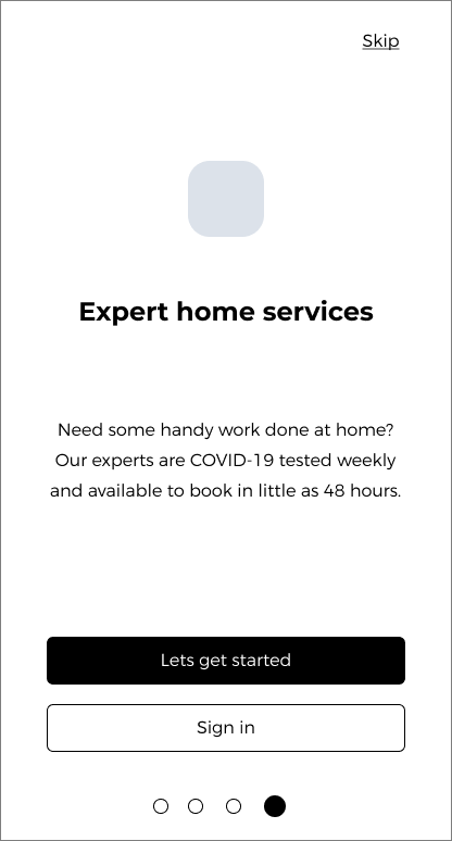
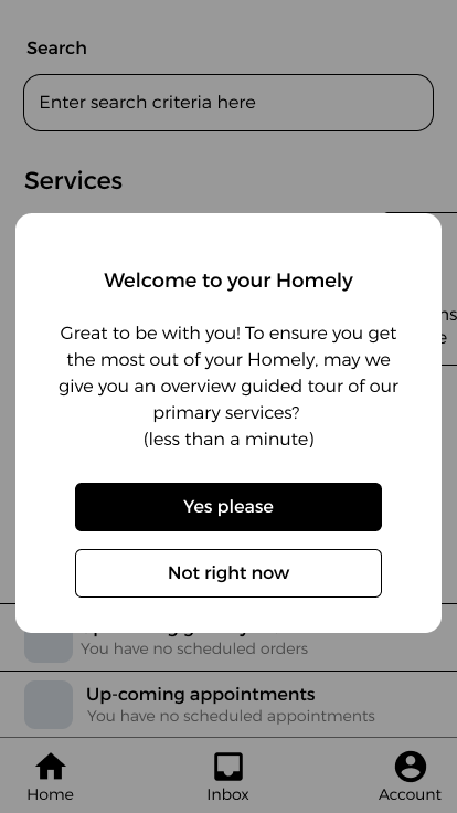
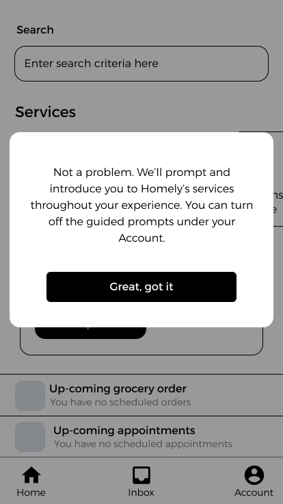
Giving how intimidating apps can be for users as they're faced with new UI they've never seen before, it can be stressful and a discouraging experience when users feel like they have to learn a new app on their own. As apparent as that might be, I needed to consider how different our user personas and how this app might be the first app for the end user.
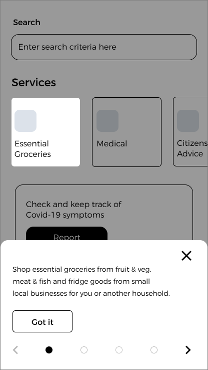
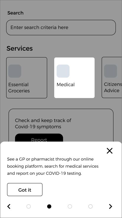
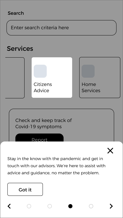
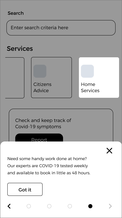
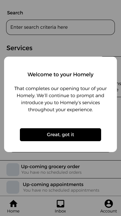
Remaining in-line with the design requirements, I knew onboarding was an an introductory communication tool of the app and its services. But whilst I've included designs that use the swipe tutorial method for the USP's, I wanted to avoid just getting the user into and leaving them.
To address this, I've complimented the initial onboarding with coach-marks which aims to point out the key features of the app. I would aim to prompt accordingly to the user for first use interaction of a particular service i.e. the user engaging with the essential grocery ordering for the very first time or hiring an expert and prompt when experts are populated and filter based on the user requirements.
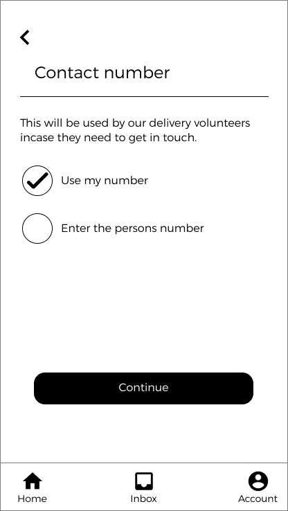
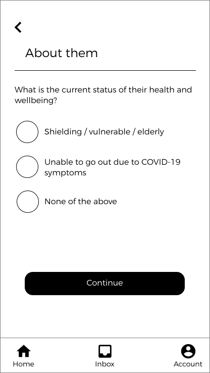
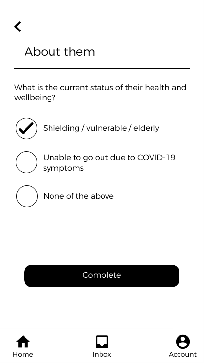
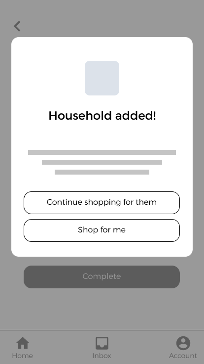
Prompting through first interaction
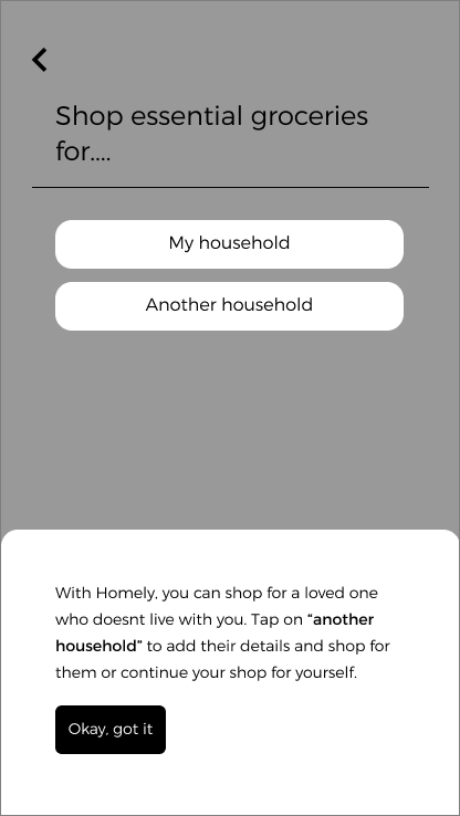
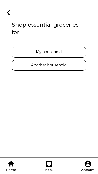
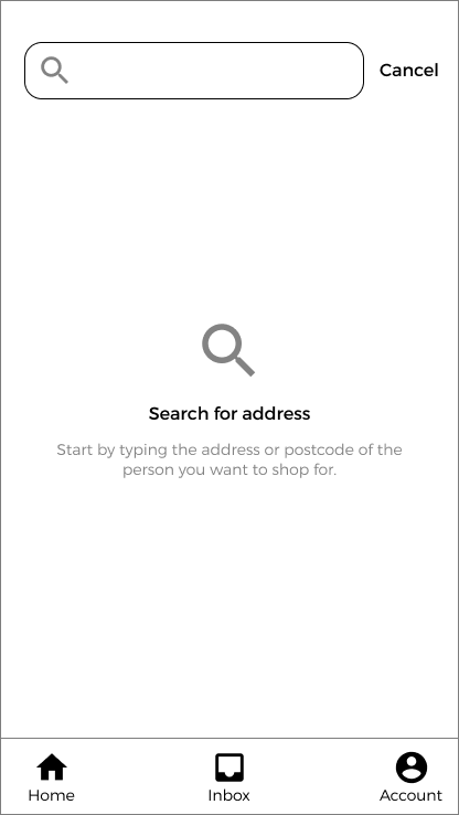
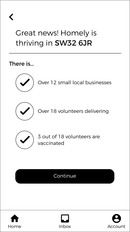
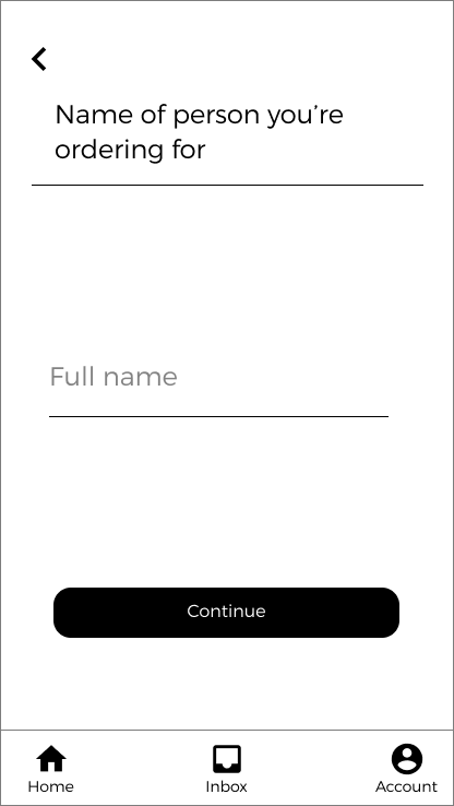
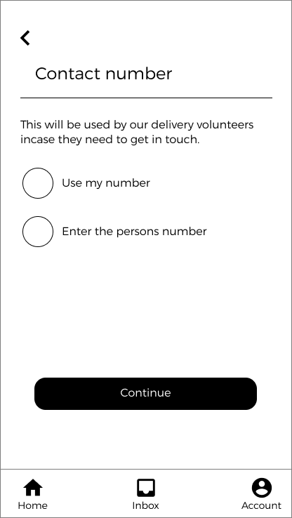
As mentioned in onboarding, the following represents a demonstrated example of how first interaction integrates coach-marks into the journey of the user adding a nominated user to their experience of grocery shopping.

Prototype
Booking a contractor
A progressive experience which enables the user to get moving quickly and completing their primary goal of booking a contractor. This experience shares patterns used across the various services available, permitting a consistent experience and avoiding cognitive dissonance.
Report symptoms
Utilising familiar patterns as seen within the booking a contractor experience, this simple and straightforward feature continues the fight against the coronavirus as users can report their symptoms for either themselves or their child.
This project is currently on-going and will be updated as soon as deliverables are ready. Lots to validate with users, designs to be iterated and user stories to be translated.
