
Hey there, this is the default text for a new paragraph. Feel free to edit this paragraph by clicking on the yellow edit icon. After you are done just click on the yellow checkmark button on the top right. Have Fun!
Hey there, this is the default text for a new paragraph. Feel free to edit this paragraph by clicking on the yellow edit icon. After you are done just click on the yellow checkmark button on the top right. Have Fun!

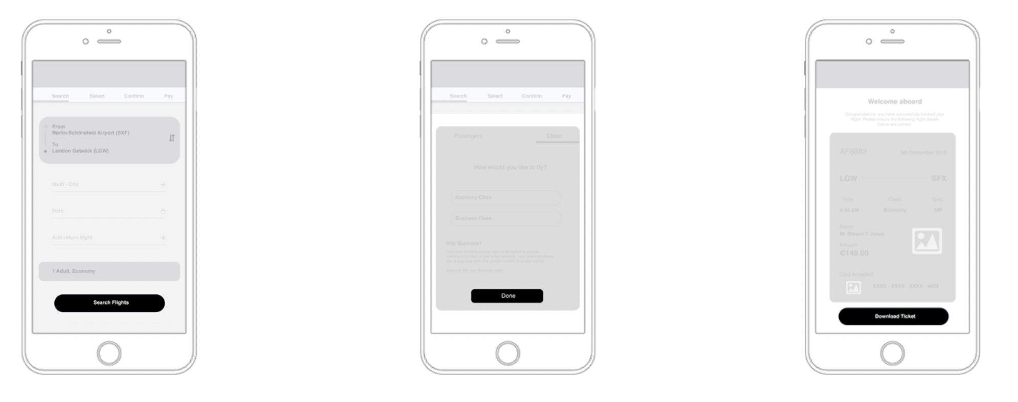
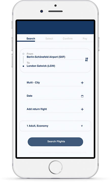
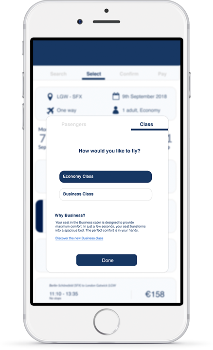
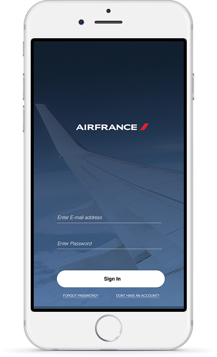
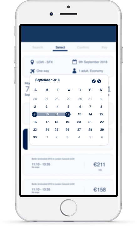
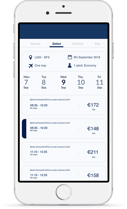
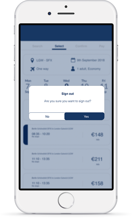
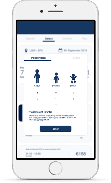
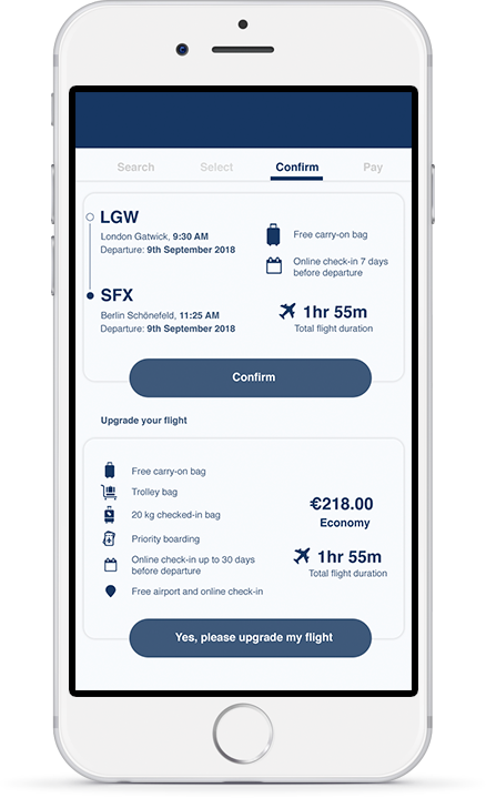
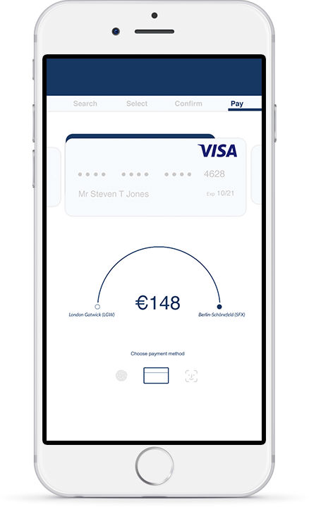
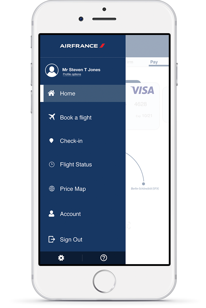
The following concept was a Request for Proposal (RFP) from Airfrance. The original brief was exploring a creative comms strategy that would also see me delivering a potential re-design of the Airfrance app. The thinking behind this was to consider the Airfrance ecosystem and how the customer journey translates from the offline to online experience across the various Airfrance products. The following is the UI concept of the app redesign.
France is in the air
To serve is to take flight
Serving 36 destinations, operating worldwide
with cargo services to 168 destinations in 78 countries.
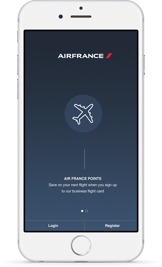
The app works funcitonally. The product does exactly what it is meant to do and has an end goal for the user. Currently, the app is not very consistent with its design and this is particularly noticeable with the visual heirarchy and arrangement of text. At times, quite overwhelming to digest the information given and the UX feels somewhat compromised because the process is not clear enough. I wanted to see if I could eithier implement some core UX improvements and / or improve the visual UI.
The Thinking
This project started with challenging the currect app. I needed to apply logic to what was being felt towards the journey and how that was informing me as a user. I questioned the app and its behaviour towards me and from this, I was able to surface optimisaiton opportunities. Some of the key problems identified was the confusing information hierarchy, various CTA’s that would continue to up-sell to the user or encourage a diversion from the primary journey and overall, the design seems rather promotional heavy
Design process
Due to the original nature of the brief and it being a request for tender, I did not have the opportunity to carry user research on the existing expeirence. Retrospectively speaking, given the correct time parametres, I would have built qualified personas and customer experience mapped to the product if the problem was defined. Objectives were set never the less and were created based on the problems identified. The objectives would define and filter decisions and would effectively enable activitiy to be prioritised.
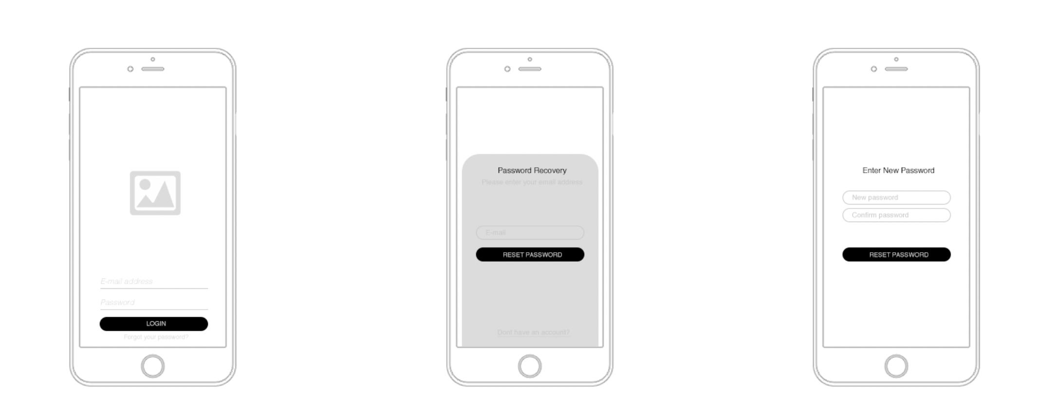
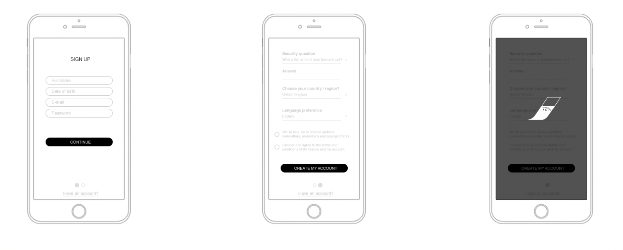
Navigation
Focusing on the most immediate expectations of the user. This removes any potential distractions around up-selling and taking the user out of their journey.
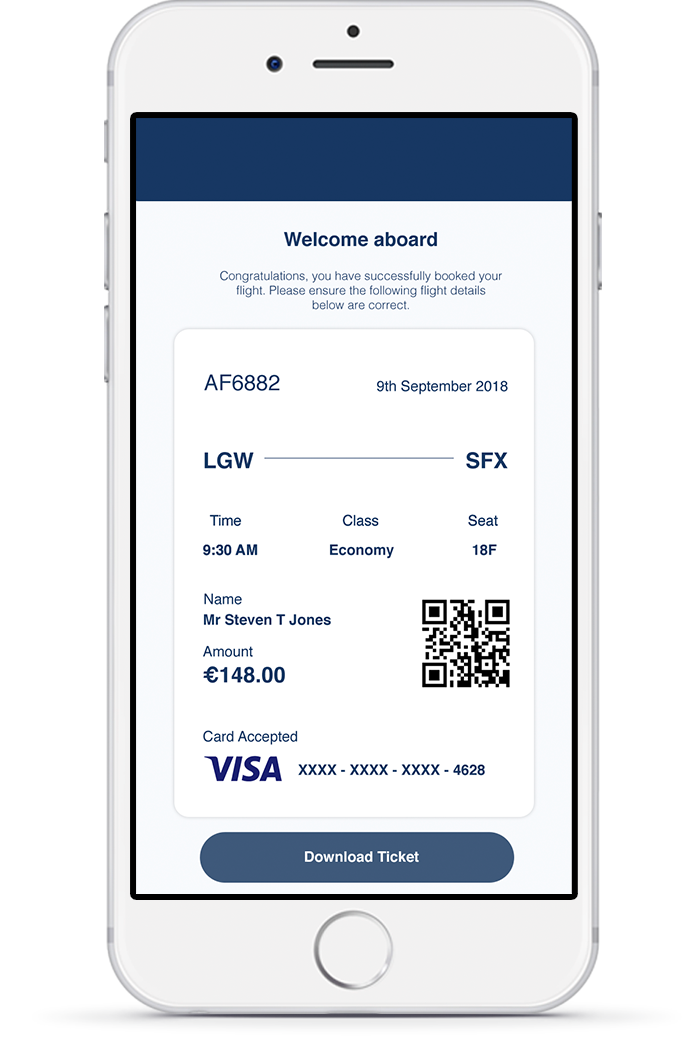
Welcome aboard
Purchased
Ticket
Ordered and structured ticket confirmation with the option to download which Air France does not yet permit.
