COMPANY
Abel & Cole
Year: 2019 - 2020
Role: UX Designer, UI Designer
Team: Product owner, Scrum master, CRO Manager,
x2 developers, x2 QA Testers
Overview
I lead the UX and UI Design on the redesign of the sign up experience. Through usability lab studies to prototyping and testing, the new experience achieved statistical significance and an uplift on sign up, first deliveries and AOV.
The prospect sign up experience was treated as the end destination at the time rather than an opportunity to leverage and communicate the brand proposition.
Process
I applied the design thinking process to the project as it allowed us to explore and define the problem space. This also really helped me evangelise UX as this would be the first time for the brand executing end-to-end UX research through to design. Stakeholder buy-in was paramount to ensure we had the right support throughout the project.
The starting point
Initial stats on the sign up experience gave us the critical awareness of the increase in risk, prompting discussion with key stakeholders which informed the scope of the project.
Research
To kick off the project, I hosted a stakeholder workshop session with the team to ensure we captured the goals, scope, internal assumptions and hypotheses of what we thought might be causing the problem. Bringing developers, analysis, testers and stakeholders created shared visibility of the work ahead and got everyone aligned as a cross-functional team. Due to this, teams could pin-point where their time would be best placed and where collaboration would be prominently needed.
Assumptions
As I had recently joined the organisation, my team were better placed to communicate what they thought the problem was. Of course our assumptions are filled with risk until validated, but by enabling the team to communicate individually their assumptions, we could agree not to treat them as facts and create that common starting point with our stakeholders.
"Our sign up is too long in length for our customers. The majority of fields are mandatory which increases user error. The mobile experience feels broken at times when attempting to navigate the page."
"We have several marketing preference questions which could be discouraging our customers from signing up or conflicting with their decision to sign up with us.
Interviews
We have a fantastic customer base who are committed to not only shopping with us, but their lifestyle is whole heartedly in support of the organic produce, our farmers and our sustainability efforts. What better way than to directly speak with our prospect customers and understand what pre-conceived expectations do customers have when they arrive on site? For returning prospect customers, what blockers are causing abandonment? Lastly, What what do prospect customers understand of Abel & Cole and our identity?
usability lab study
I moderated and conducted 10 usability lab studies with the team over 2 days to validate our assumptions with framed research questions to support the quantitative data we had by observing our customers shopping with us and signing up; identifying some of the most apparent pain points and what we could take away to drive low effort / high value quick wins. I opted for 10 participants rather than Jakob Nielsens recommended 5 which intends to capture approximately 80% of the problems because A&C have different target audiences and the mobile experience was vastly different to that of the browser experience.

Defining the problem
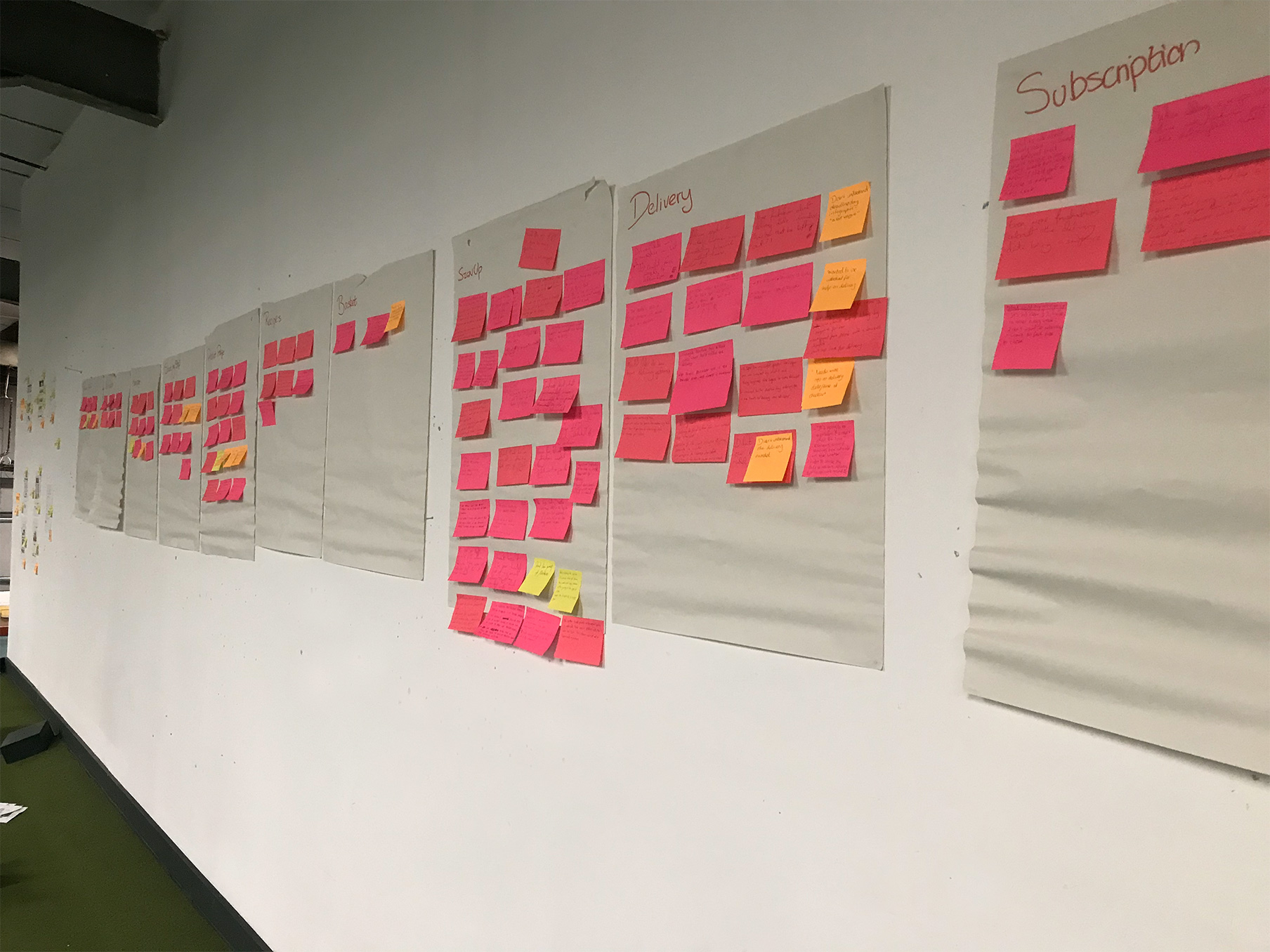
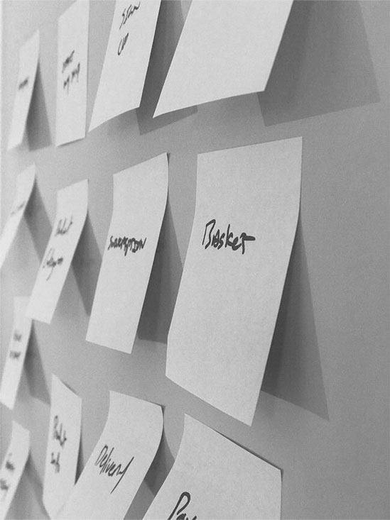
Affinity mapping all the data
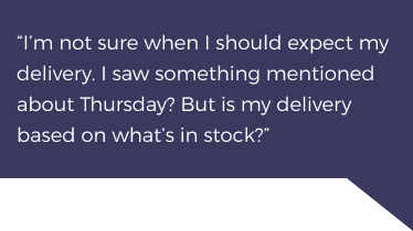
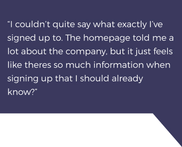
Affinity mapping effectively communicated to the team the problems and opportunities we had and we could see from the sign up experience alone this was rather significant. Considering the scope of the project and KPI's we wanted to positively impact on, we prioritised our thinking around quantified problems as this was often attached to a strong reaction or quote.

user stories
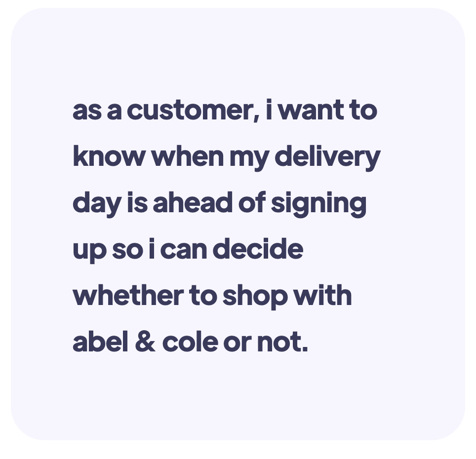
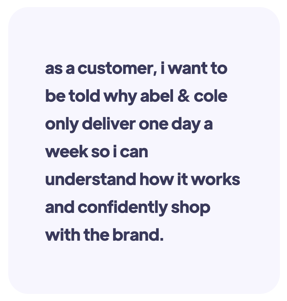
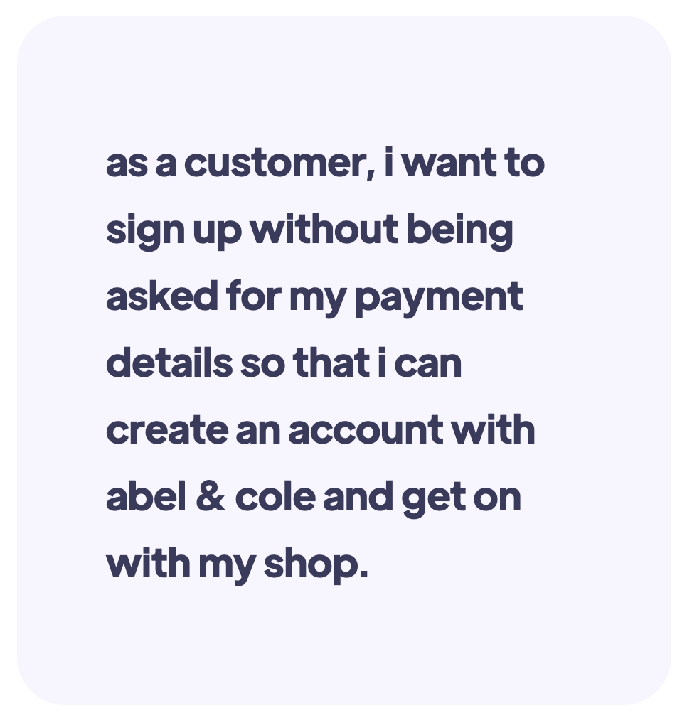
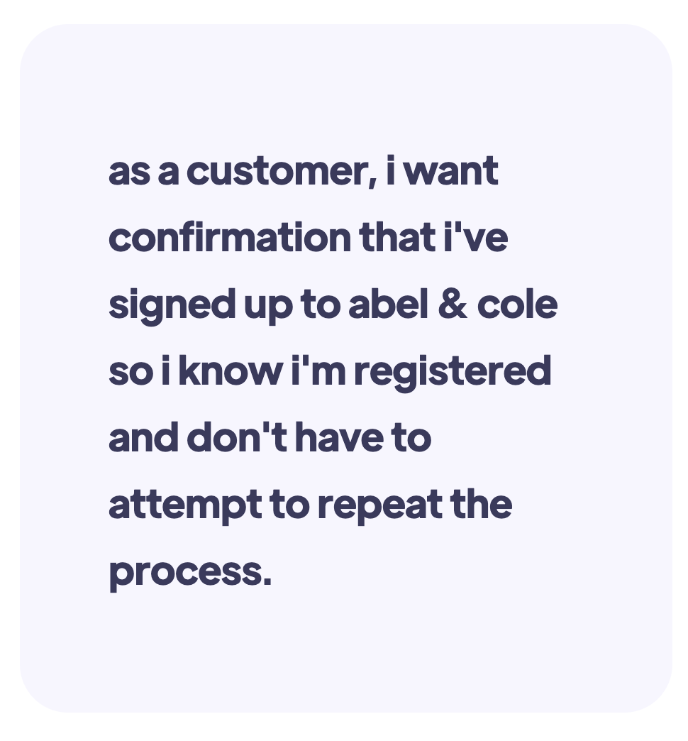
With the insights obtained from a mixture of responses and observations, we translated the problems into actionable user stories which we would enable us to start pointing our thinking and designs to.
Task analysis and user flow
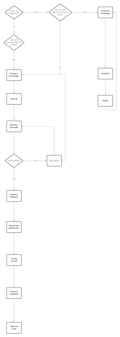
The following allowed us as a scrum team to rally round the decisions we were making so that our developers were remaining customer centric with validated thinking from the usability testing which allowed us to reduce technical debt as we integrated a new experience.
1. explore the brand
2. check to see if abel & cole deliver to me
3. create my account
It is not often that a customer necessarily just wants to create an account without first carrying out their shop - what would be the benefit in doing so? Unless the customer has arrived from an acquisition / referral with an incentive of course.
Breaking the flow down...
1) Explore the brand; what is meant by this is that we knew from from the users we spoke to that they have preconceived assumptions that we operate like any other ecommerce organisation.
2) The most critical stage within the Abel & Cole journey as it connects to our business model and values.
3) The end goal for the customer. By this point, we want to ensure that any new customers are confident in how we work.
Design considerations
Delivery
“Delivery” is typically shown towards the end of a checkout process for the majority of supermarket brands. For us, it was vital that we communicated how we deliver and when we deliver to the customer in the first instance, without taking the customer away from the shopping experience.
Visiblity
We needed to visibly show the customer where they’re at in the sign up experience to avoid confusion and getting lost. If customers want to sanity check specific brand information, we want to keep this contained within the sign up experience to avoid exit rates.
Behaviour intent
We needed to get away from serving the same journey regardless of customer behaviour intent. This includes collecting the right data from the customer when requested and identifying the appropriate journey to fulfil our customers needs.
Subscription
Similar to our delivery model, Abel & Cole is a subscription business, meaning that products are ordered on a frequency to create convenience for the customer and to remain as sustainable as we can with our minimal miles on the road. New customers require the need to become familiar with the brand and trust us through our USP’s.
Validation
Abel & Cole is a premium brand and it is a decision for our customers to not only shop with us, but to make lifestyle switch to organic food. The new experience needed to give customers validation for singing and recognise their decision to increase confidence in managing their first or second order.!
Progressive
We found the average time for a customer to sign up was longer than anticipated. The new experience needed to serve only the necessary information and should feel quick and progressive as to avoid motivation being compromised.
Sketches
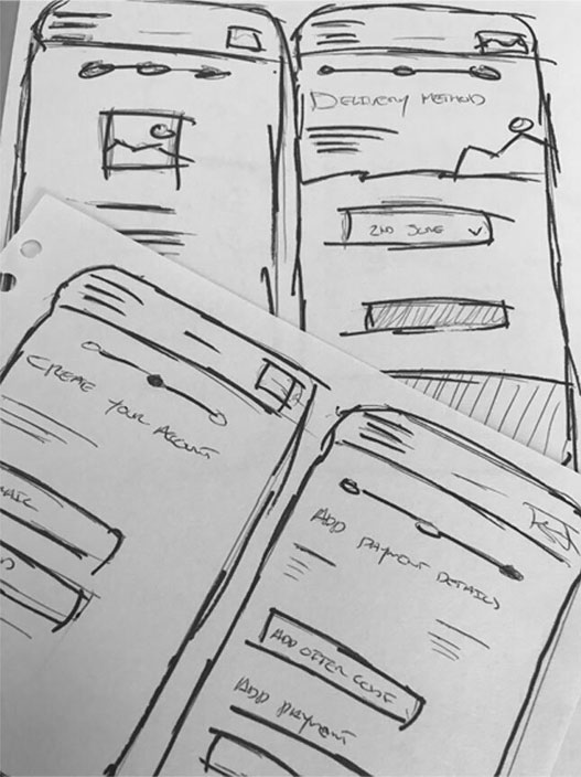
With the user research obtained, business needs defined and goals set, I captured a few initial ideas from the key insights I was hearing from the lab studies and the observations of how our customers were reacting. I didnt want to decide too much time to this and so I time-boxed 30 minutes to interpret the qualitative data.
Wireframes
The wireframes were able to communicate to the team and stakeholders of how we took Design Thinking with the user research we obtained and confirm that we were answering both business needs and goals that were initially set out.
The wireframes were able to communicate what it meant by designing mobile first and that thinking opened up the team to strongly consider how are we best helping our customer? The wireframes created new questions for the stakeholders to address - the need and requirement to not overwhelm the user in order to better understand the Abel & Cole proposition was apparent in what the wireframes were aiming to achieve. That feel for the user in that they’re making quick and progressive decisions to get them to their goal by accomplishing smaller goals within the journey.
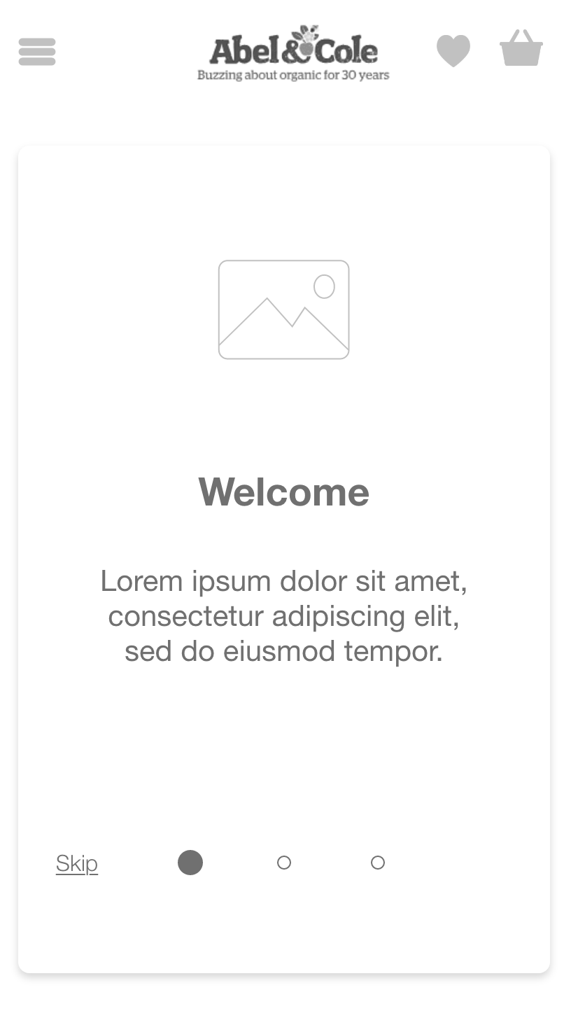
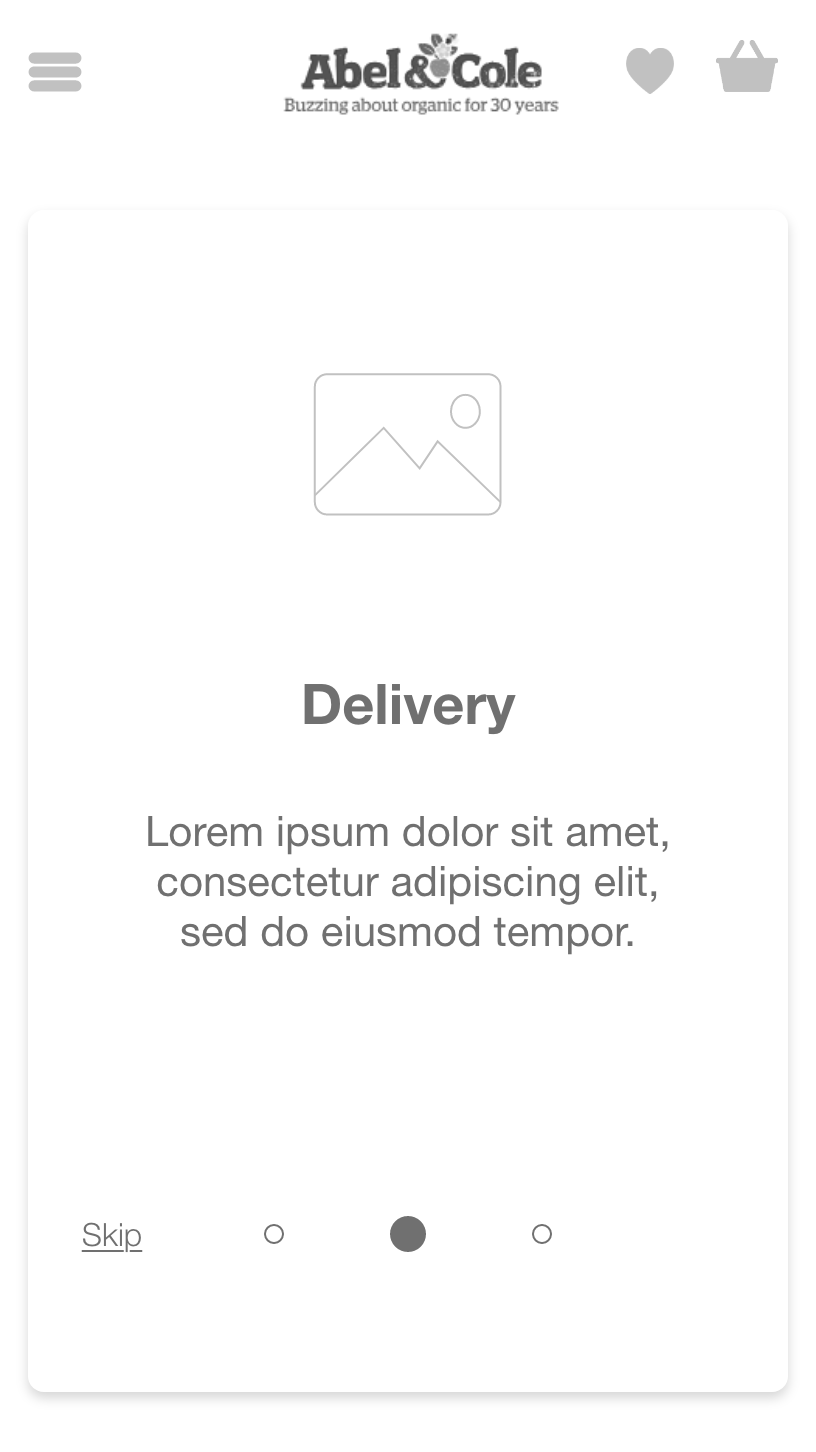
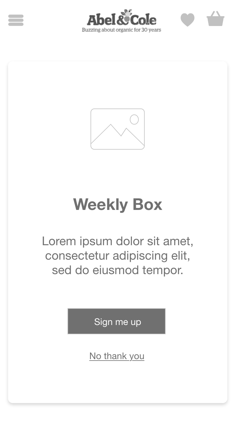
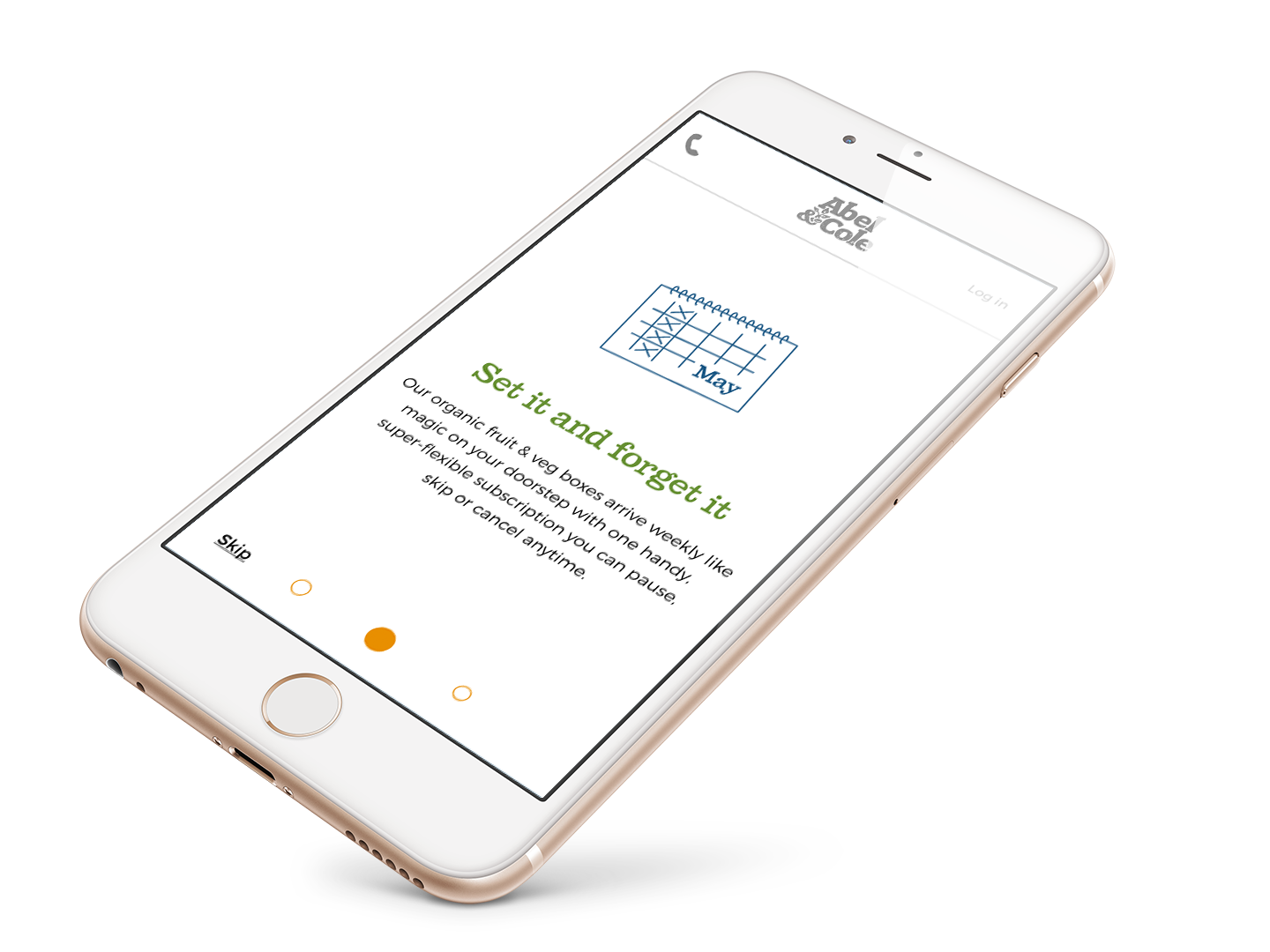
These 3 onboarding screens were the the very first designs which would attempt to solve the problem. As a team we discussed and challenged our thinking as we considered the barriers which our customers had flagged during the usability lab study. Whilst we recognised the need to communicate our USP's in a clear and cohesive manner, we perhaps needed to look at better integrating the information which wouldn't risk users "skipping" the journey.
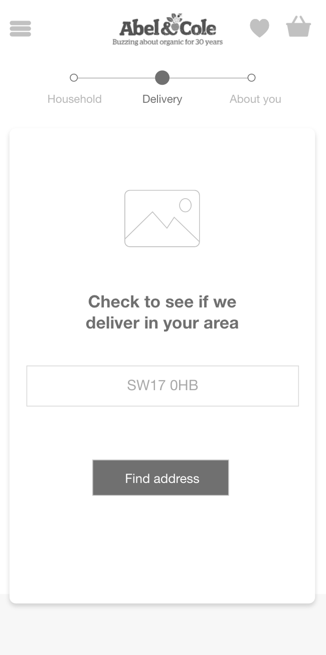
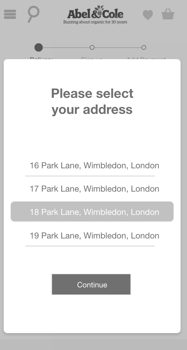
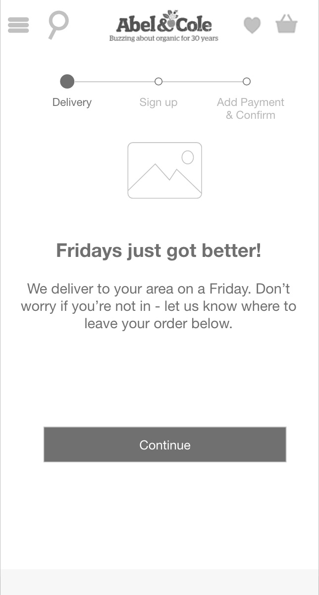
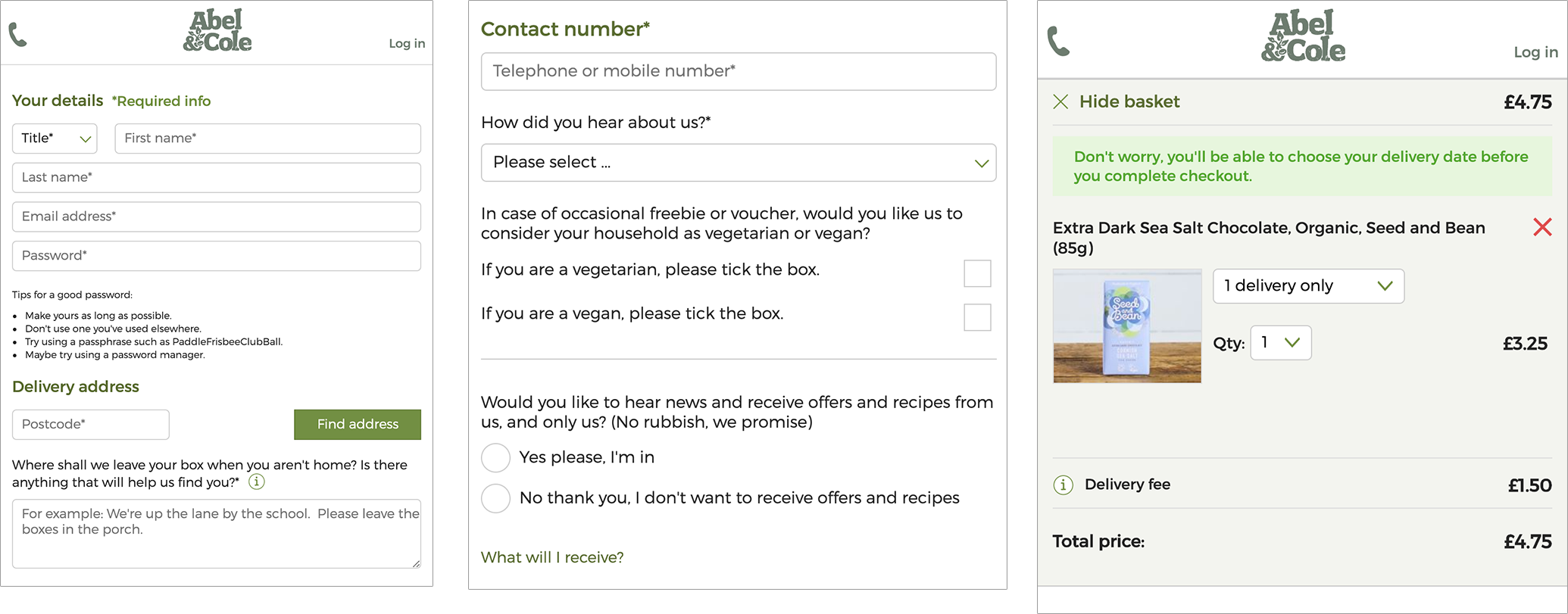
Our original "create account" experience was cluttered with messaging and lengthy forms. As a brand, we had placed all of the most important information for a customer within the the environment of this particular section.
Our customers weren't reading or acknowledging what was being communicated and jumped immediately to where the input forms were as a way of escape. Due to this, customers were making assumptions against our expectations. By considering the requirements of email and password entires from the customer in it's own stage, customers would know this is the last stage to complete and achieve their task as well as only be prompted for user errors within this section only and not one entire long page.
We had to balance out the business requirement of including marketing preferences "How did you hear about us" - this was important for our CRM channels and audience targeting. As we consider the original sign up page, this particular requirement for customers was a busy area with too much surrounding information as we observed from the usability lab testing. Customers were fatiguing by this point in the original experience as they would have filled in multiple form fields and just wanted to get through to the next stage. By starting to separate our create account section with clear distinct progression indicators, users would know from the immediate
High-fidelity designs
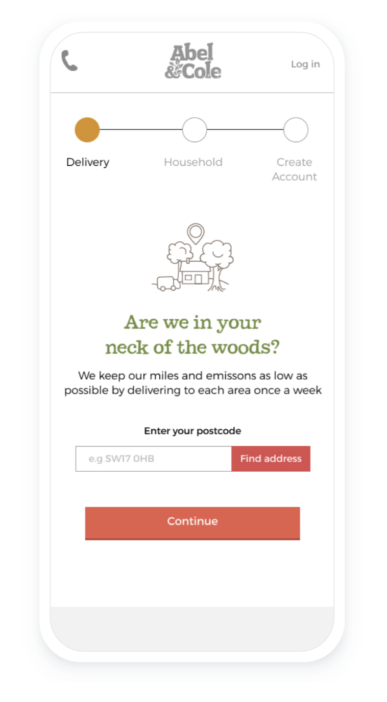
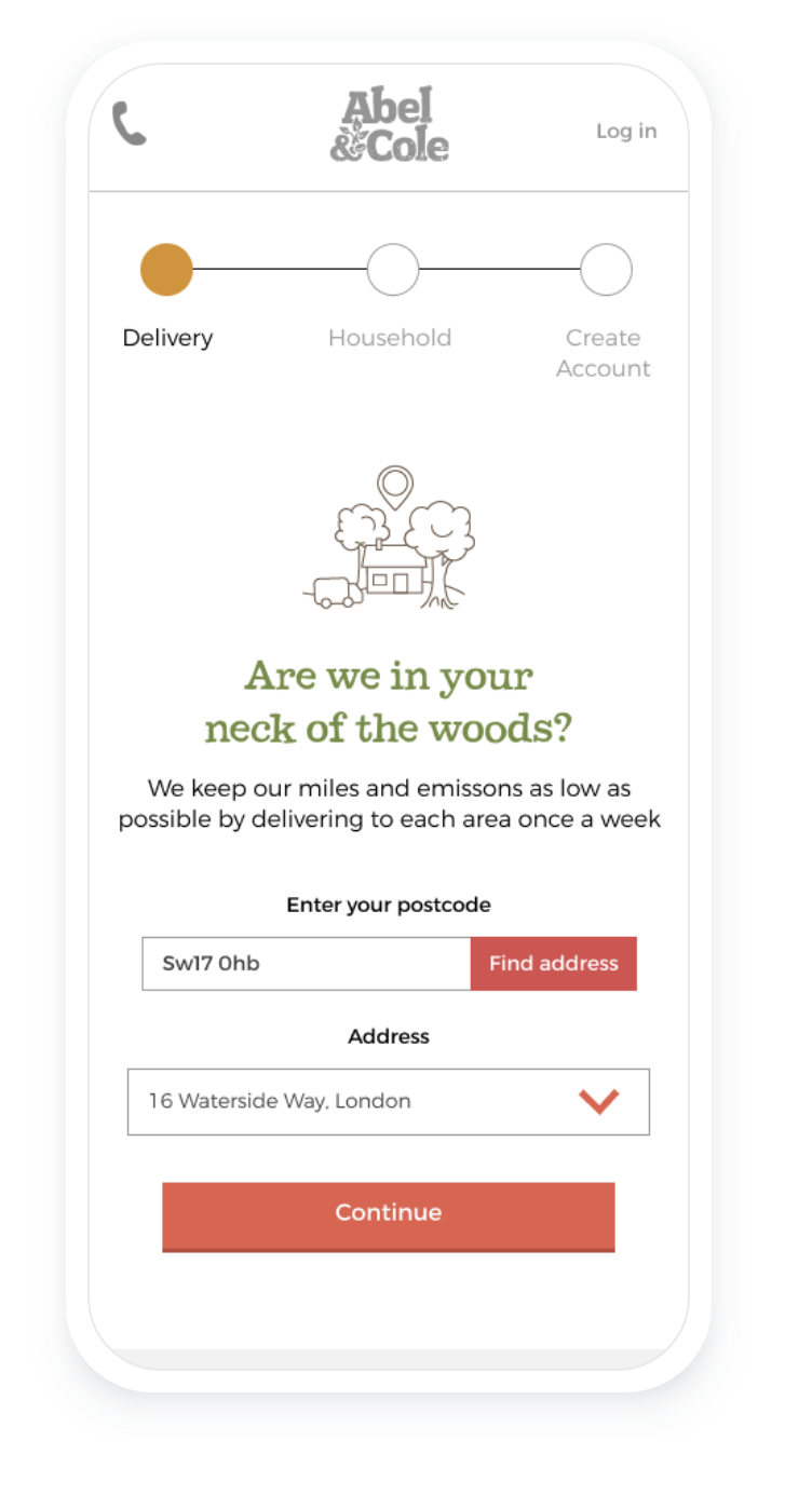
I took the wireframes having got them presented and approved and began to translate them into high-fidelity mockups. This process went through numerous iterations and really challenged the brand from how we communicated to the customer, the aesthetics of the brand and usability.
The balance between business across the teams and getting that customer balance right was challenging and yet, it opened up a new UX project surrounding the topic of Inclusive Design and Accessibility.
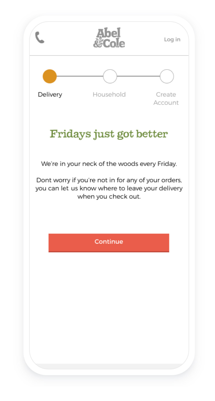
Personalisation
Whilst the original experience had this tucked away in a drop down form, customers felt this was just another marketing preference that was being overlooked. With the revised design, we pulled this out and defined this stage as part of the sign up experience.
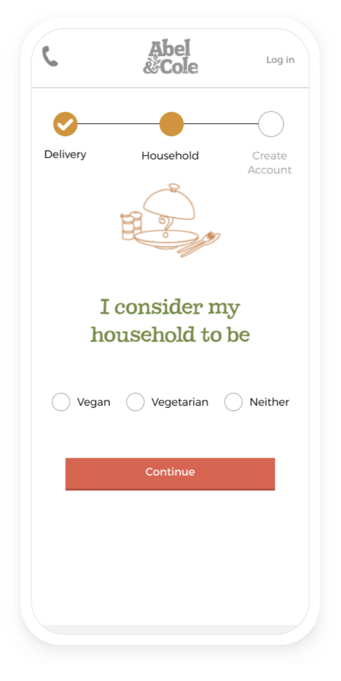
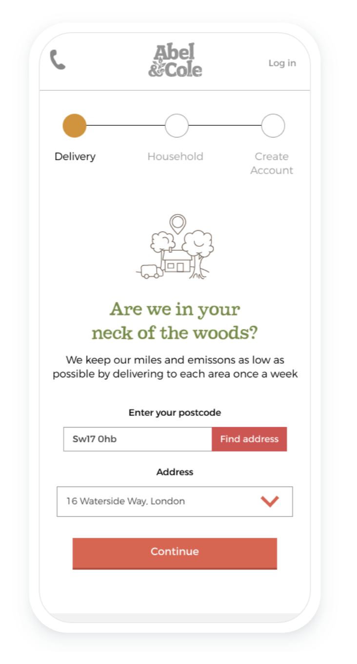
Delivery
We justified the reason behind our delivery model and defined the delivery stage rather than tooltip / secondary messaging.
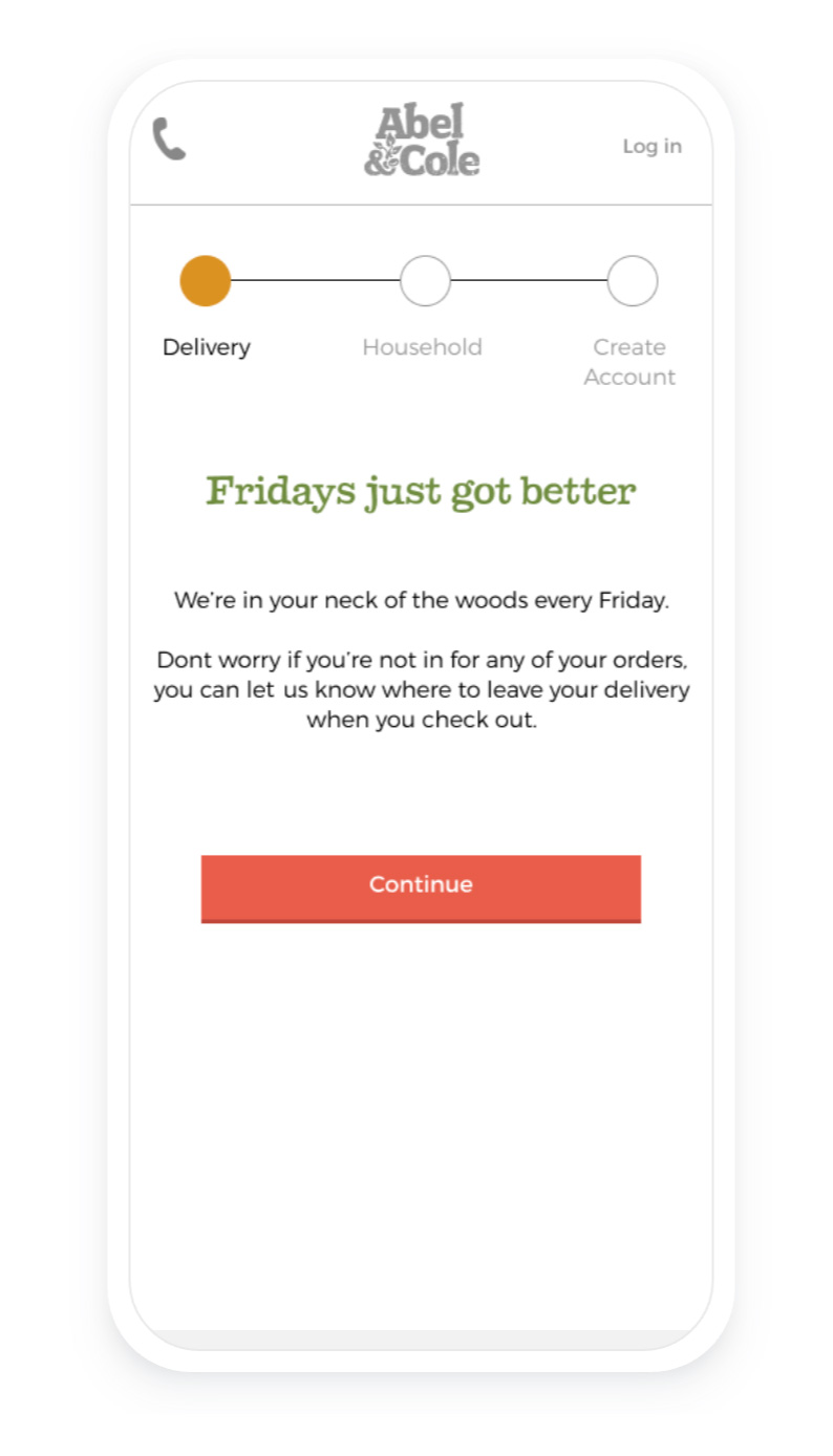
Validation
From the user testing we did at the start, we knew that customers didn't feel absolutely certain how and when we would deliver to them. The same day / one delivery a week messaging was often being missed prior to customers signing up and during.
Impact
With a mobile first approach, we were able to simplify the experience in reduction of interaction cost by presenting only the key requirements for our customers to sign up with us. The journey takes a step back as we removed the clutter surrounding what was most important to prospect customers.
a/b test results
We a/b tested the original against the variant for 6 weeks, achieving 100% statistical significance in the following;
53%
Order complete CVR to sign up starts: 11.5% to 17.6%
38%
Order complete CVR to sessions: 4.7% to 6.5
54%
first deliveries CVR to sign up starts: 8.8% to 13.5%
39%
first deliveries to sessions: 3.6% to 5.0%
Retrospective
Due to the timing of this project within the financial year, we didnt have the opportunity to validate the designs / prototype with actual customers. In the beginning, I had put forward my reasons to conduct initial research rather than taking a Lean UX approach as the team had various internal assumptions of the problem which we needed to clarify. We got an MVP launched and delivered value, but I would encourage a more iterative approach when we look at this project again.
