
COMPANY
Keakie
Year: 2021 - 2022
Role: Product designer
Team: Product owner/CTO, iOS Developer, Android Developer, CEO, Head of curation, Curator relations lead, various music curators
Overview
Joining Keakie as the inaugural UX/UI hire, I spearheaded the end-to-end design and experience for its Minimum Viable Product (MVP) across iOS and Android platforms. Collaborating in a lean Scrum setup with cross-functional stakeholders, we launched successfully in just four months, a testament to rapid alignment, high organisation, and agility.
Approach & process
Given an unestablished user base, we adopted a Lean UX approach, rapidly defining problems, testing with internal audiences like DJs, mixers, and genre curators, and continuously iterating. Resource limitations meant adapting workflows and prioritising deliverables efficiently to move the needle.
Establish a strategic north star
Stakeholder interview
Stakeholder interviews helped ground the product in meaningful context rather than pursuing an app for its own sake. Key insights included:
- Users often remain in familiar music zones; playlists frequently lack discovery.
- Playlists gain value when curated by human experts, not algorithms alone.
- Contextual personalization—aligned with mood or activity—offers richer discovery than conventional feeds.
At the time, Keakie's site had been in existence for 2 years approx, so I wasnt starting completely from a blank slate. Whilst there were no qualt or quant data to draw from, I wanted to absorb from the CTO (founder) the story of Keakie to date. I needed to better understand Keakie in its wider context of music and the thinking behind the product.
I wanted to get beyond this need to launch an app because that is a solution to an unknown problem. Whilst Keakie was not in a position to validate whether an app is the right thing to do, it was fundamental for me to understand why would a user choose us over Spotify or Apple Music? Are we attempting to reinvent a wheel that doesn't need to be touched? The questions and the dialogue went beyond the scope, the goals of the product and who is Keakie's audience. This stakeholder interview was the deeper context needed in order to shape how might we redefine how users discover music which in turn, would become Keakie's USP.
"Users stick to the same music they know with little or no motivation to discover new music when it comes to platforms like Spotify. Being able to create a playlist is a detrimental feature as we're contained within our comfort zone."
"The reason why a user would choose song "X" or "this" playlist is because they believe it represents their mood or activity. Contextual listening needs to be at the front through personalisation, not the other way round where users need to treasure hunt for it."
"What is the point of a playlist in which a user becomes so familiar with, that over time they just start skipping the majority of the tracks listed? What if playlists were curated by DJ's and specialist music curators?"
"Personalisation as a term is thrown around so loosely. What does it mean have to have a personalised listening experience? Music that we love is either recommended to us or something we hear in passing. We want to bring that human touch to users through expert curation."
Aligning via shared assumptions
The app had an initial roadmap shaped by input from our key stakeholders, but we needed a shared starting point to align the entire team. To achieve this, we ran assumption-mapping sessions, capturing our best-informed guesses about user needs, product direction, and potential risks. By openly declaring these assumptions, we created space for collaboration and critical discussion—inviting music industry experts, curators, the CEO, and our CTO to challenge ideas, surface unknowns, and collectively define the problems we were solving and how best to approach them.
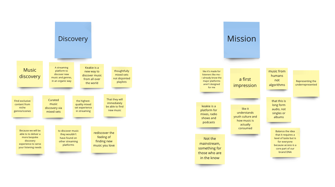
By working in this cross functional capacity, we're immediately increasing the product thinking of the entire team. The team not only voices their opinions and concerns, but are able to hear other points of view which moves them from a discipline specific view to a broader and holistic product focused one.
Over 70 responses were generated from the team and categorised into themes / topics which were then prioristed or de-prioritised, voted and discussed collectively. This would become our anchor into shaping our MVP in order to start delivering value for hosts, new listeners and wider conversations.
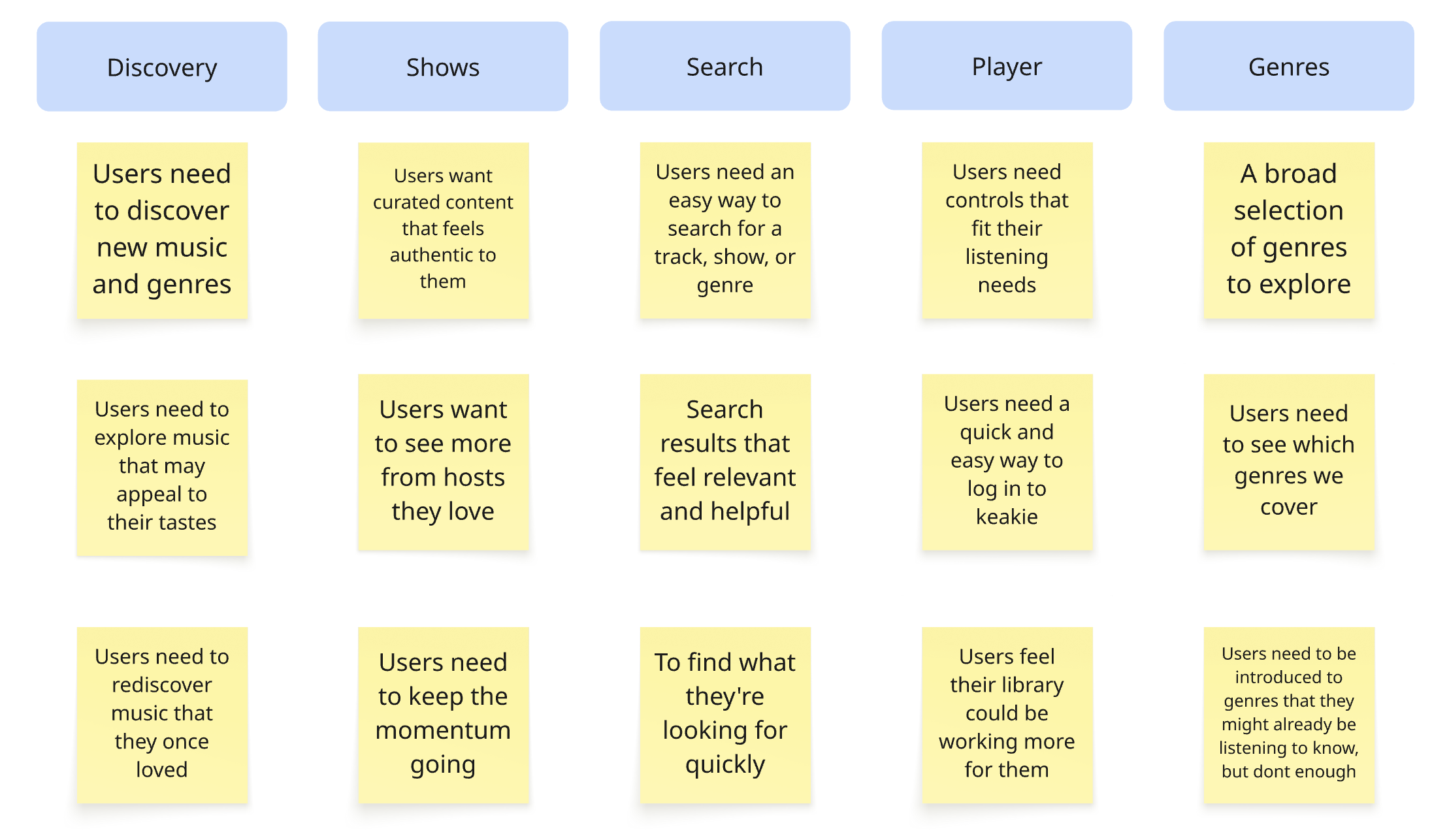
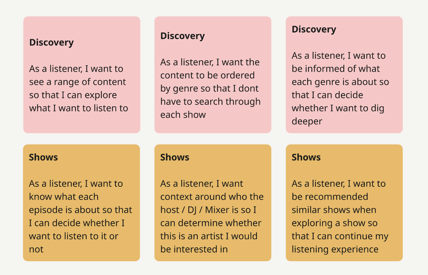
Defining the problem
User stories
Once the team had aligned on priorities, my role was to turn those into tangible, actionable user stories. Each story was framed with clear acceptance criteria, giving our developers clarity while ensuring stakeholders understood exactly what success looked like. By agreeing on these criteria up front, we removed ambiguity and avoided surprises later in the process, whether in design critiques or when gathering user feedback.
This approach not only kept the team focused, but also created a shared language that connected strategy, design, and execution—helping us move faster while staying aligned on what truly mattered for our users.
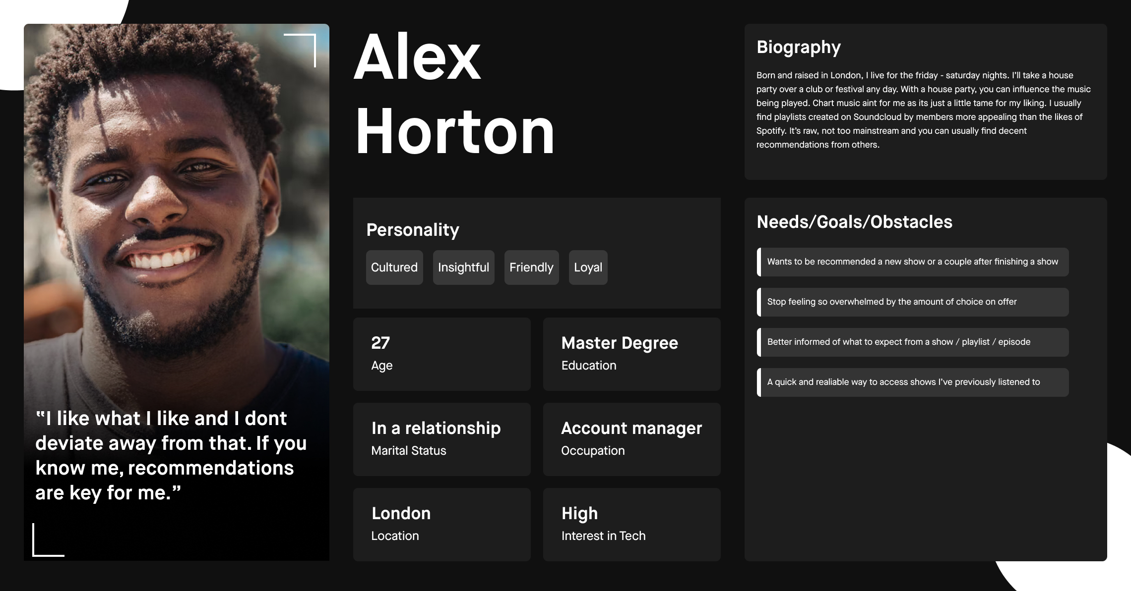
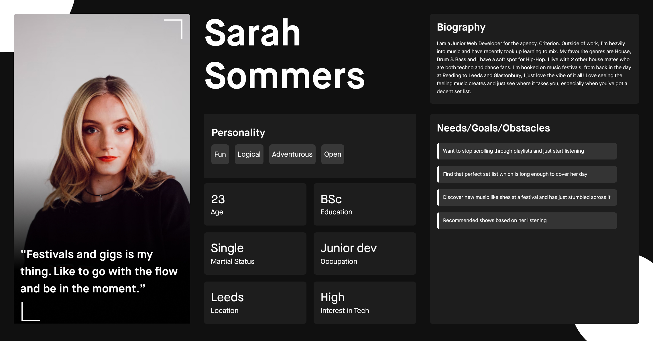
Proto-Personas
In the absence of formal user research at this early stage, I introduced proto-personas as a lightweight, flexible way to align the team on who we were designing for and the problems we were solving. Unlike traditional personas, which are often static and based on completed research, proto-personas evolve. They allowed us to move quickly, grounding our decisions in informed assumptions while staying open to change as we learned more about our users.
These proto-personas became a shared reference point for the team, helping us prioritise features for the MVP and reminding everyone that we are not the end users. As new insights emerged, we revisited and refined them, ensuring our understanding of user needs stayed current and could eventually feed into a broader discovery phase.
Design Considerations
Content first
Our shows and curated content are what make Keakie unique. The design should elevate the content, not compete with it. We focused on creating a clear information hierarchy and a stripped-back visual approach so listeners can easily discover and engage with what matters most, the music.
Context builds trust
Not all listeners will know our hosts or the stories behind each show. Providing the right information at the right time builds confidence and connection. While we’re still exploring how much context adds value, part of Keakie’s role as a discovery platform is ensuring listeners feel informed and guided throughout their journey.
Meeting core expectations
Regardless of our mission, Keakie is a music streaming platform and with that comes a set of baseline user expectations around usability and behaviour. Listeners expect certain standards, like intuitive navigation, predictable playback, and smooth interactions. Meeting these expectations ensures trust and positions us to deliver unique value on top.
Simplicity over complexity
We designed with focus and clarity in mind. By avoiding unnecessary clutter and distractions, we enable listeners to engage directly with episodes — our golden path. Keakie’s offering is unique, but our introduction needed to be simple, intuitive, and familiar, allowing users to connect with content quickly without over-engineering the experience.
High-fidelity designs
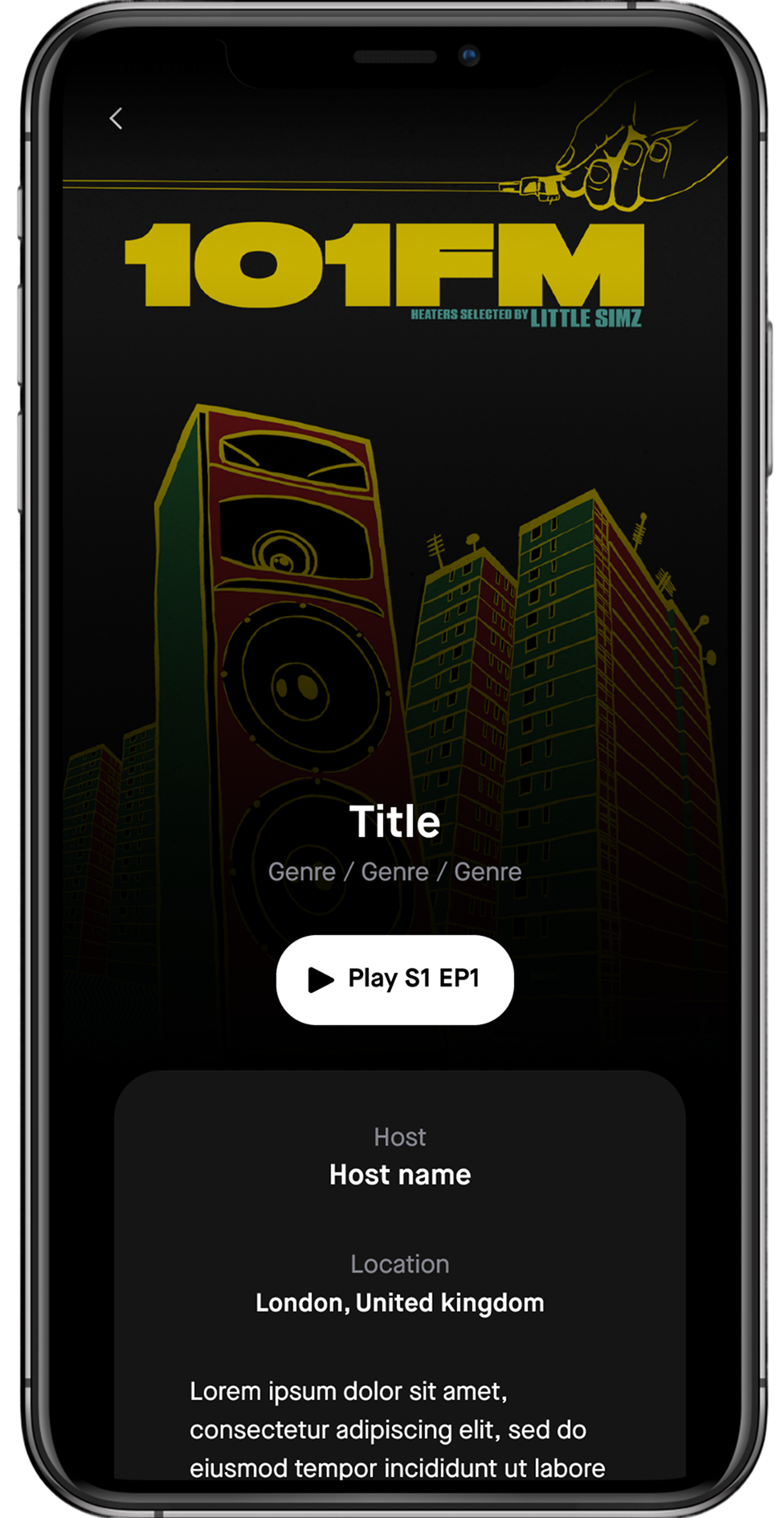
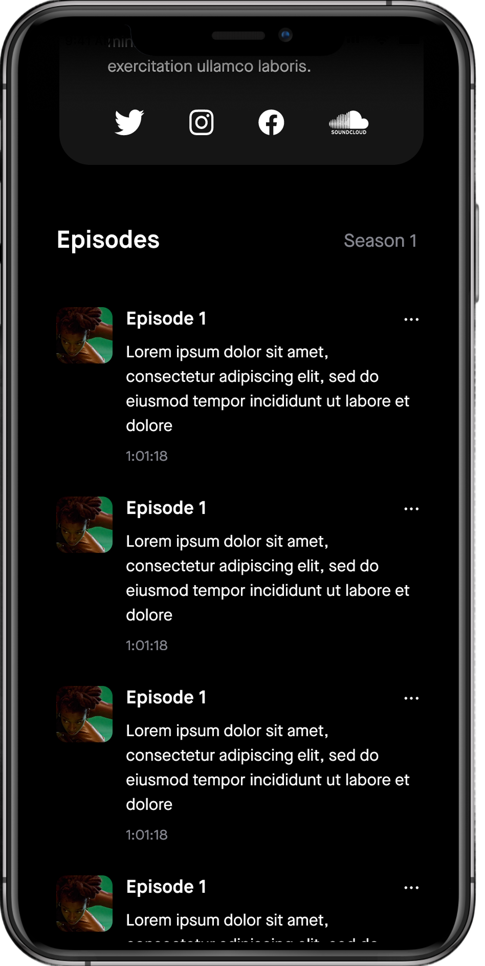
Shows
Since Keakie already had an established website, I focused on adapting its existing visual language rather than reinventing it. The goal wasn’t to introduce a full rebrand or unnecessary new components, but instead to extend the current look and feel into the app while keeping effort and complexity low.
When designing the Shows experience, the information hierarchy was critical. Listeners needed to quickly understand who the host is and what the show is about before engaging. Discovery sits at the heart of Keakie’s mission, so presenting the right context at the right time was essential. By prioritising clarity and relevance, we encouraged users to become familiar with a show’s tone and style before deciding to listen, helping them make more confident and informed choices.
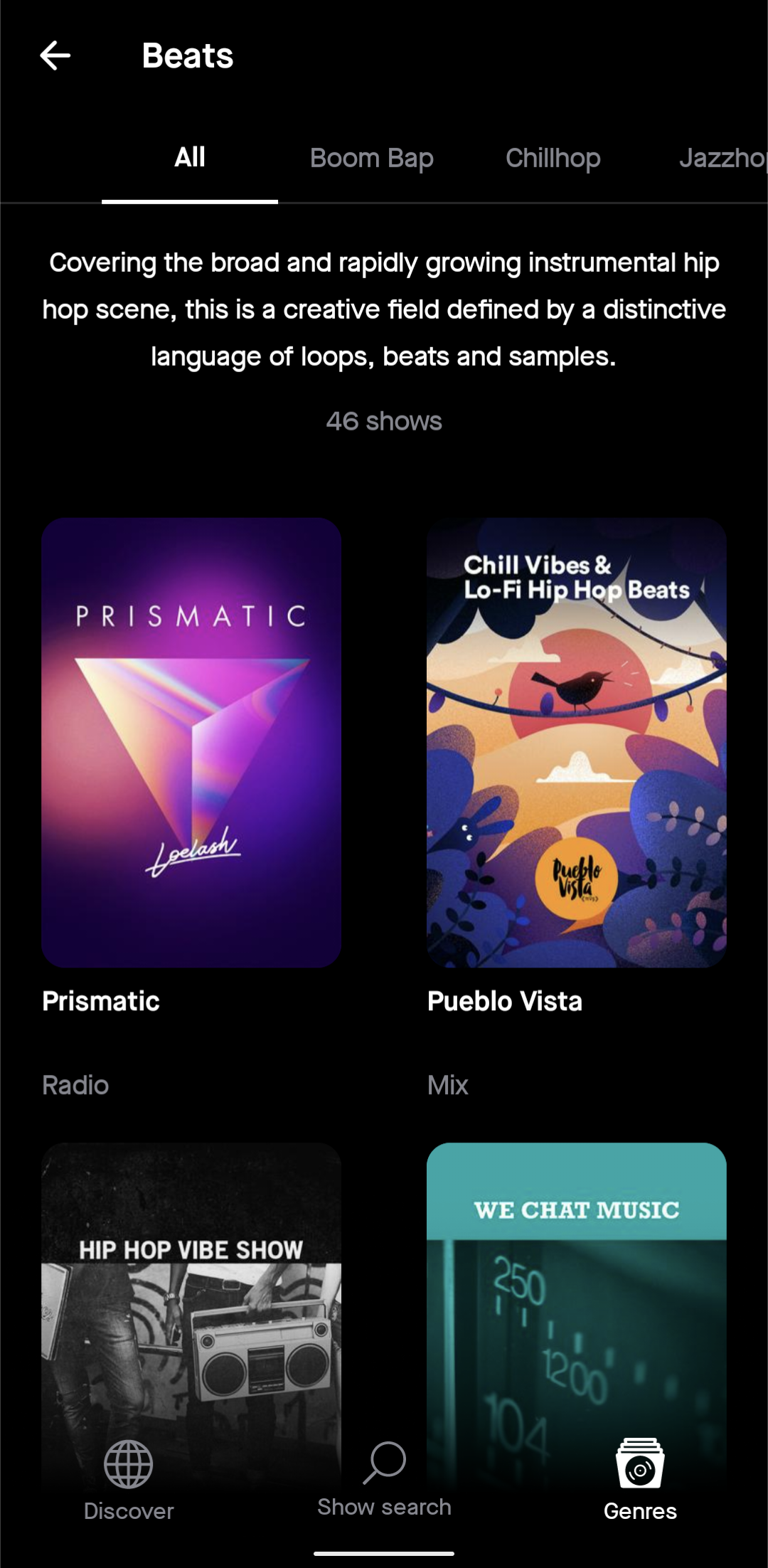
Discovery
This is the first screen users encounter after logging in, making it a critical moment in shaping how discovery works on Keakie. At this early stage, we relied on genres to guide users, since individual shows would likely be unfamiliar to most. Our goal was to surface relevant content quickly while testing the value of displaying key metadatam, such as whether a show is a mix, radio episode, or podcast alongside its artwork, helping users make informed decisions about what to explore.
Keakie’s mission is to represent the underrepresented, with every show curated by humans, not algorithms. While this page lays the foundation for our discovery experience, we also see significant opportunities to evolve it beyond the MVP, for example, by introducing richer recommendations and more personalised pathways. For now, we’ve delivered a simple, focused entry point that lets users dive straight into a show with minimal friction, creating an immediate sense of exploration and engagement.
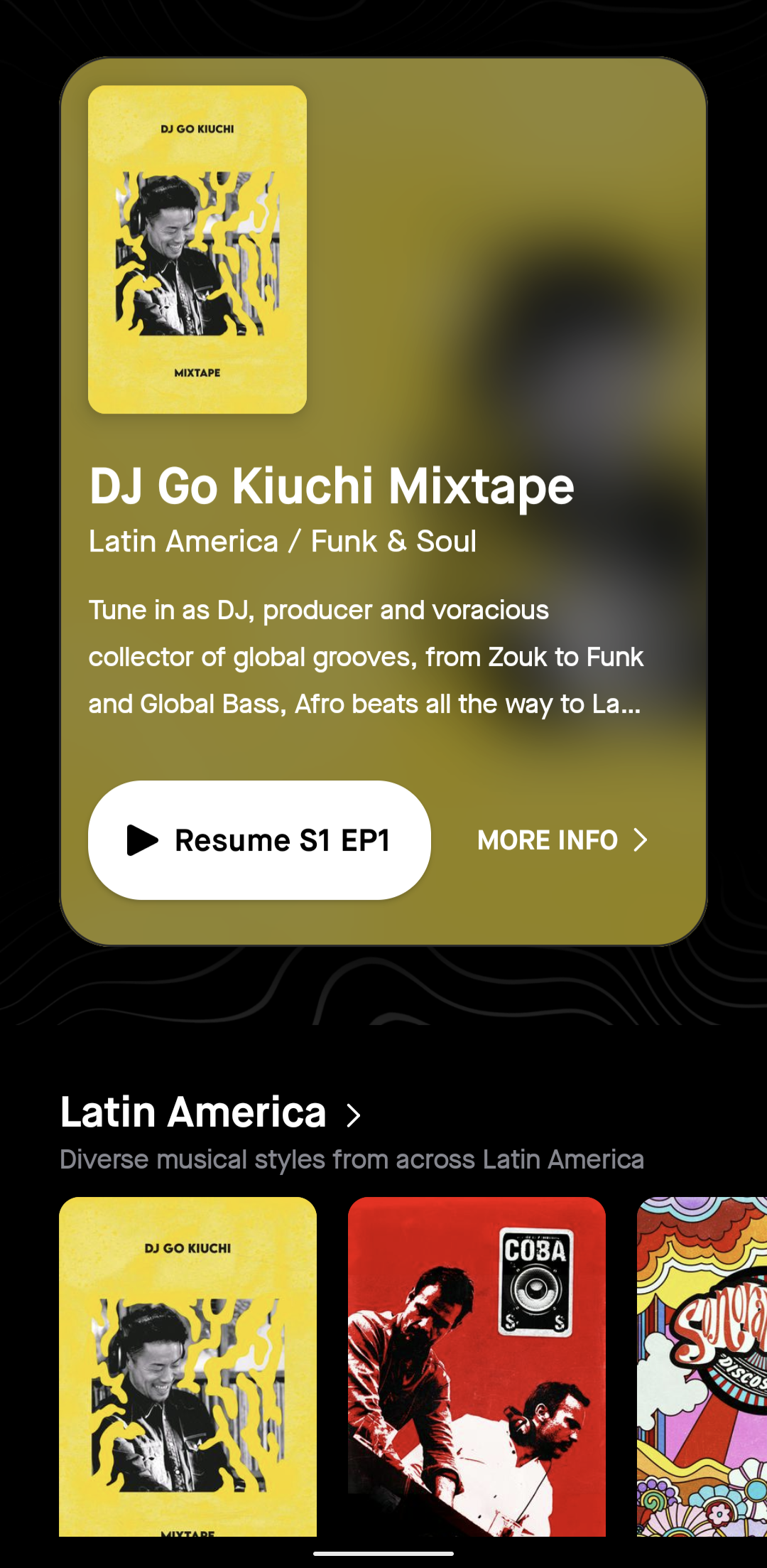
At the top of the page, users are served a recommended show, followed by a curated list of organised genres, each paired with a short description. This helps guide users, especially when they encounter less familiar or underground genres, by giving them just enough context to make confident choices.
Following Hick’s Law, we intentionally limit the number of shows displayed within the initial viewport. By reducing cognitive load, we make it easier for users to browse, decide, and move forward without feeling overwhelmed.
Over time, both the genre order and the shows surfaced dynamically adapt based on the user’s listening habits and engagement with specific genres or sub-genres, creating a more personalised discovery experience.
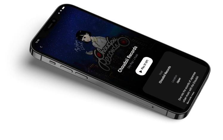
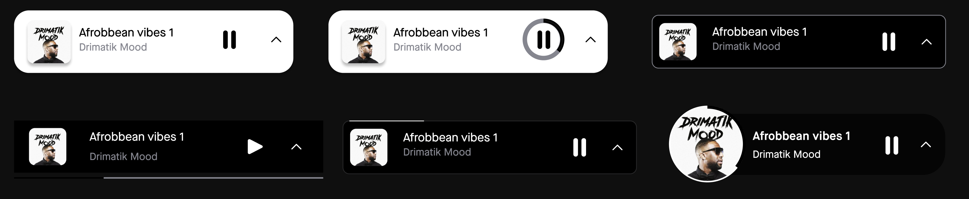
Designing the mini-player
Unlike other parts of the product, the mini-player came with clear expectations around the information we needed to display. The real challenge was how to present this information in a way that elevates the host and showcases the show, without overwhelming the user or disrupting their browsing experience.
We explored over 20 design variations, rapidly iterating to find the right balance between functionality and personality. While we looked at established patterns from other streaming platforms for inspiration, our goal wasn’t to re-invent the wheel — it was to define a mini-player that feels uniquely Keakie. The final design strikes this balance, giving users a familiar, intuitive control while reflecting the platform’s curated, human-first identity.
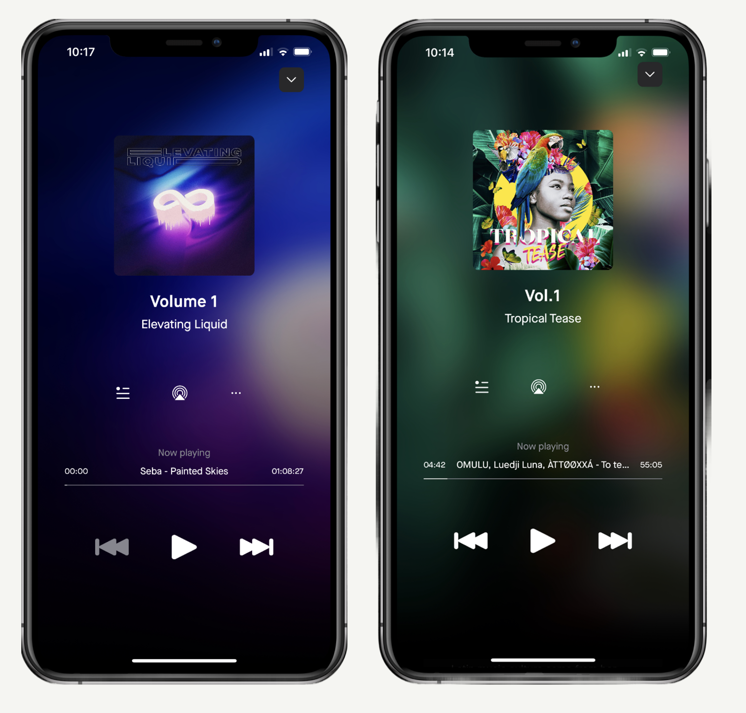
The full-screen player (FSP) was designed before the mini-player and directly influenced the final variant we launched on the app stores. It provided an opportunity to showcase the host and their content more prominently, with the show artwork subtly integrated into the background to create a sense of immersion without distraction.
The biggest challenge was defining the hierarchy of information. We prioritised the episode title as the primary header, reflecting the user’s immediate context they’re listening to a specific episode, not browsing the show catalog.
A secondary consideration was the “Now Playing” metadata, which highlights the current track within an episode. Unlike other streaming platforms, we didn’t want this detail to dominate the interface, so we reduced its prominence while ensuring it remained accessible and easy to find for users who value it.
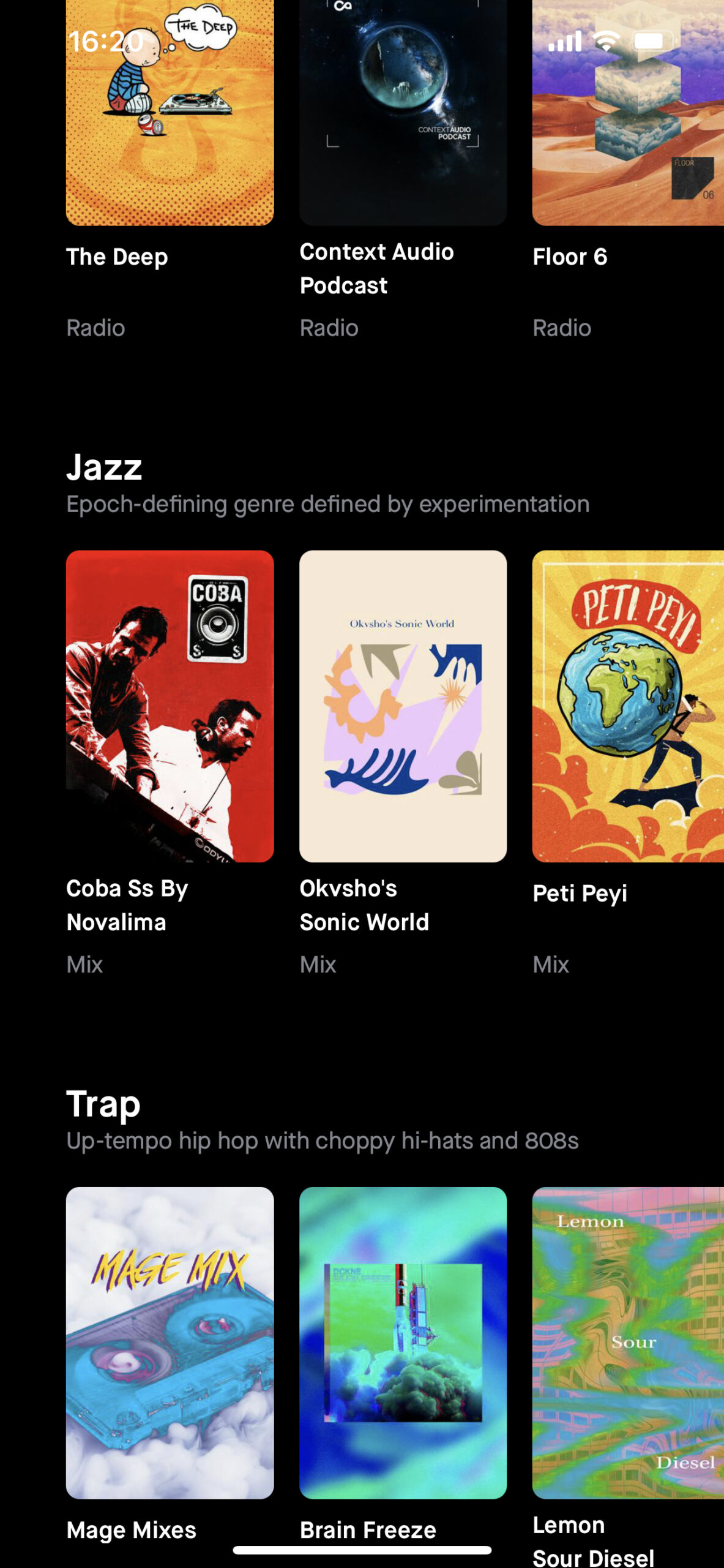
Designing for genre & sub-genre discovery
With 16 parent genres, one of our challenges was bridging the gap between sub-genres and the listener’s understanding. For example, a casual user might not immediately recognise the difference between Liquid and Neurofunk, even though both sit under the broader Drum & Bass category.
Our goal was to empower users with context, by helping them feel confident not only about what they’re about to listen to but also enabling them to discover and identify with new genres they may not have explored before.
Sometimes, it’s the smallest details, the BPM shift, a slight tempo change, or the energy of a track that defines a sub-genre. By surfacing these distinctions in a clear, approachable way, we aimed to deepen musical understanding while making the discovery experience more personal and rewarding.
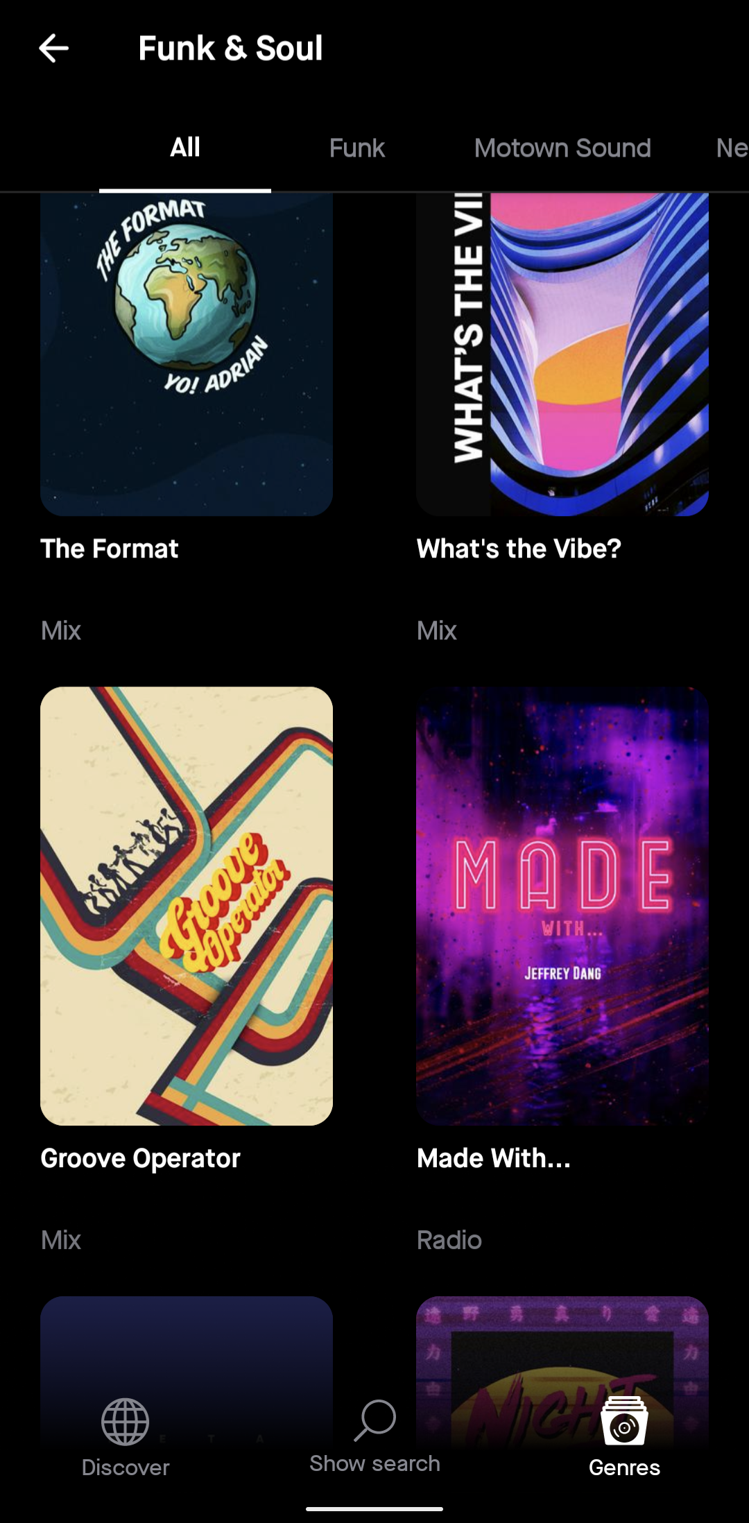
Since there’s no limit to how many sub-genres a parent genre could eventually contain, it was important to future-proof the design. We explored options such as a grid layout, but felt this risked overwhelming users and adding unnecessary complexity.
At this stage in the journey, we had to ask: is the user here to explore broadly or to search with intent? For the MVP, we opted for a simplified list view. This approach gave us confidence that we were prioritising clarity over clutter, ensuring users could engage with genres at their own pace without being overloaded with information.
Test & Learn
Keakie’s early stages, we didn’t yet have an established audience, but we did have access to a valuable network of industry professionals — including hosts, DJs, and music curators who were directly involved in shaping the platform’s content. These individuals became an essential part of our feedback loop.
We adopted a lightweight usability testing approach, focusing on rapid feedback rather than formal, time-intensive research. We tested whatever was ready at the time, from low-fidelity wireframes to high-fidelity prototypes which enabled us to validate ideas quickly and uncover mismatches between our internal assumptions and user expectations.
Any feedback that wasn’t immediately actionable was placed in a “parking lot” to be revisited later, helping us spot emerging patterns without slowing delivery. This test-and-learn mindset allowed us to iterate faster, keeping us aligned with both the needs of our creators and the long-term vision for the product.
Retrospective
This is just the beginning. We're in the app stores and Keakie is yet to secure the funding it requires to officially launch and drive acquisition. We achieved on delivering an MVP app and we're continously receiving positive and constructive feedback. The app has achieved a 4.8 rating.
What I felt went particularly well was being able to continously discuss and work with our leadership team to challenge our thinking and always to be recalling on the problem that we're trying to solve through our deliverables. By working in such close collaboration, we were designing together in theory and was always striving to be user-centric, despite not having the resource or cadence of user testing.
At times, we got caught up in the nuances of our outputs which really should have been handled at design crit stages or blocked out for discussion. Nevertheless, we kept moving forwards and successfully delivered the app.