COMPANY
Abel & Cole
Year: 2019 - 2020
Role: UX Designer, UI Designer
Team: Product owner, Scrum master, CRO Manager, x2 developers, x2 QA testers
Overview
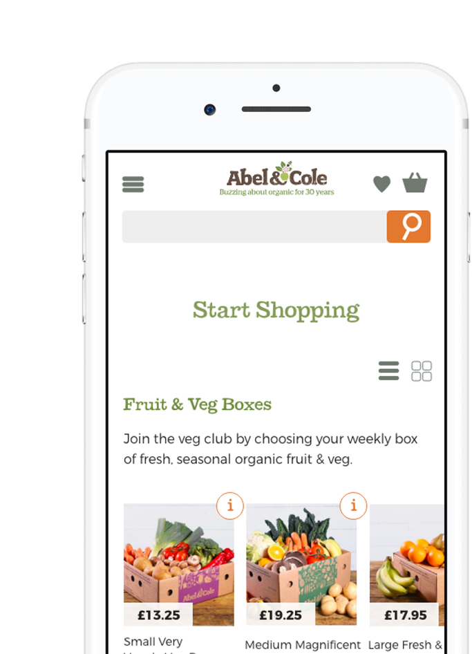
I lead the UX and UI Design on the redesign of the Start My Shop page for prospect / new customers. Statistical significance was seen across order complete and add to basket rate. Whilst our UX lab findings surfaced significant compromises in the experience, we focused on the smallest incremental changes that that could be made in time with the sign up experience redesign.
Process
Being agile and becuase of the wealth of qualitative data we obtained, we were empowered to cross work streams between the sign up experience and the Start My Shop page. Managing our stakeholders expectations, there was ambition to make radical and drastic changes to the entire experience of Start My Shop. As a scrum team, we championed remaning incremental to the existing page and obtaining key learnings to better understand and define the problem.
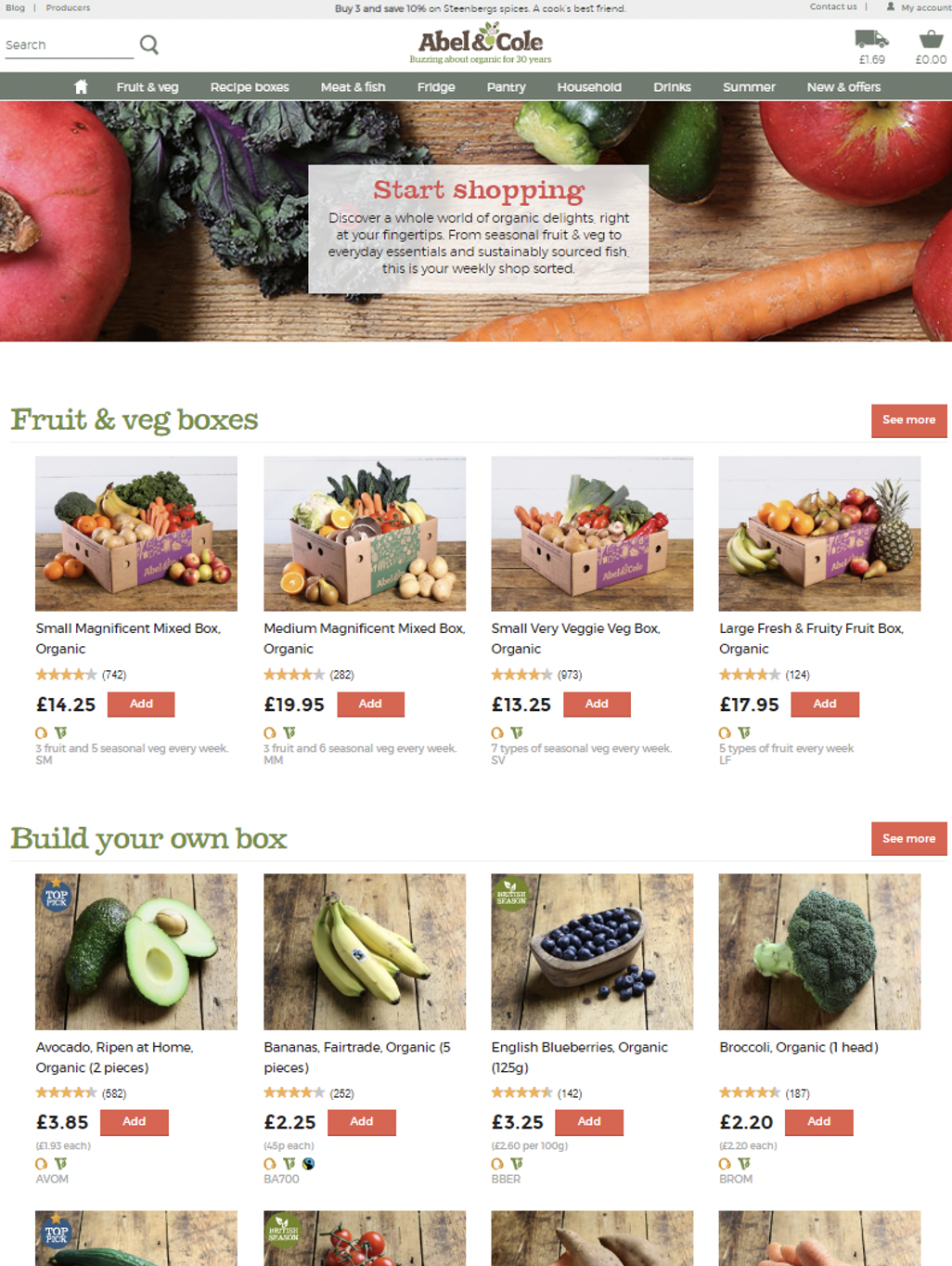
Extract of old start my shop experience

Research
We needed to speak to not only non-registered customers but also those that had received their first delivery with us in order to recall their experience with the page. What are some of the assumptions around "Start My Shop" - what does it mean to a customer and how does that then play into their expectations of the product and service?
Usability lab study
It was crticial to find out if Abel & Cole had even designed the right thing - this experience around Start My Shop had no validation behind the thinking and it's intention to serve the customer. What is "Start My Shop" solving for a customer? What problems from a usability perspective are we perhaps not getting right for our customers?
- Participants were observed navigating the Start My Shop page across mobile and desktop completing primary tasks.
- Participants were asked framed questions around their assumptions of certain product services
- Participants evaulated how helpful the page is

Defining the problem
It was important to find out if Abel & Cole had even designed the right thing - this experience around Start My Shop had no validation yet behind the thinking and it's intention to serve the customer. What is "Start My Shop" solving for a customer? What problems from a usability perspective are we perhaps not getting right for our customers
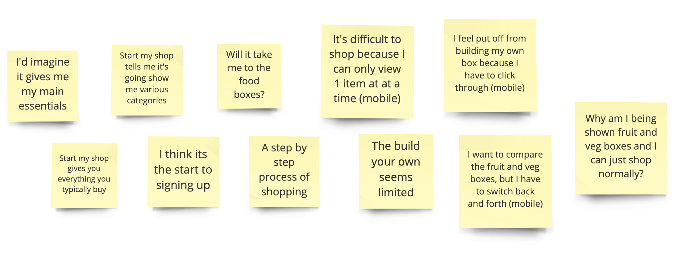
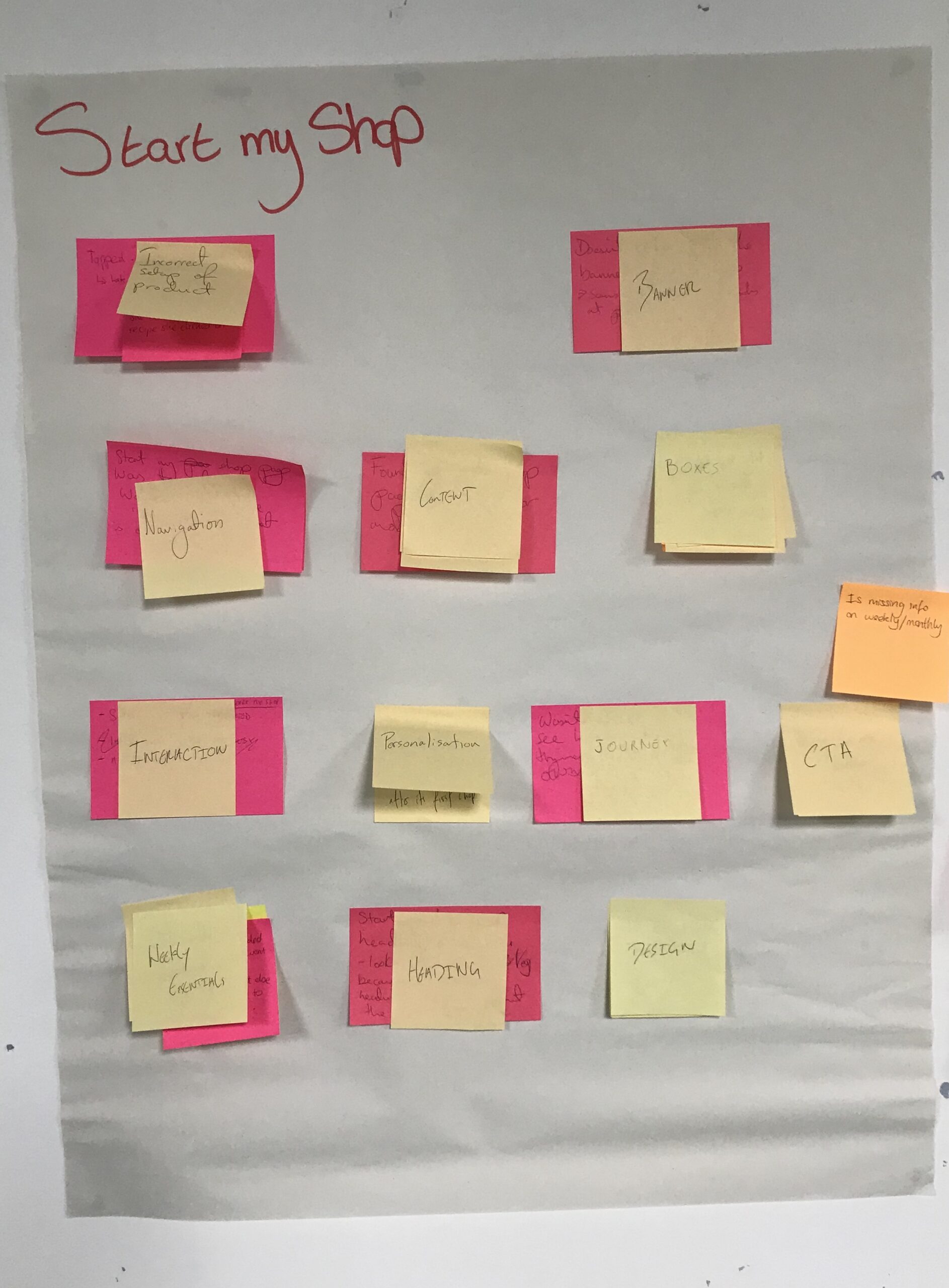
Our research efforts clearly communicated that the term "Start My Shop" just wasn't clear and because of this, we were potentially encouraging high interaction cost and beginning to see why exit rates were so high.
Actionable insights that we found;
- Expectations of Start My Shop was not met as a service to customers
- Definition of what Abel & Cole meant by "Build your own box" wasn't clear and how this fits within the bigger customer journey and proposition
- Significant usability issues on mobile with customers wanting to abandon due to its heavy request from the user to interact with the categories
- Product card details creating cognitive overload with the amount of information
- Customers felt overwhelmed and uncertain on where they would explore as they kept the subscription nature at front of mind and how they might compromise their experience
The problems that were surfaced needed to be prioritised due to the sign up project in scope and how this would work in support of that experience for a new customer. Our product owner prioritised our MVP to focus on the usability nature of mobile as a low effort / high value deliverable with the intent that we would re-visit Start My Shop post A/B testing.
Design considerations
Discoverability
The existing solution on-load would present a maximum of 6 product items on mobile, one represent each category. Participants are unaware of the range of per category listed as well as what would be presented to them.
Low interaction cost
Customers are required to interact with each product in order to see the next product available to shop. This in turn was compromising the user and resulting in a poor experience.
Wireframes & Definitions
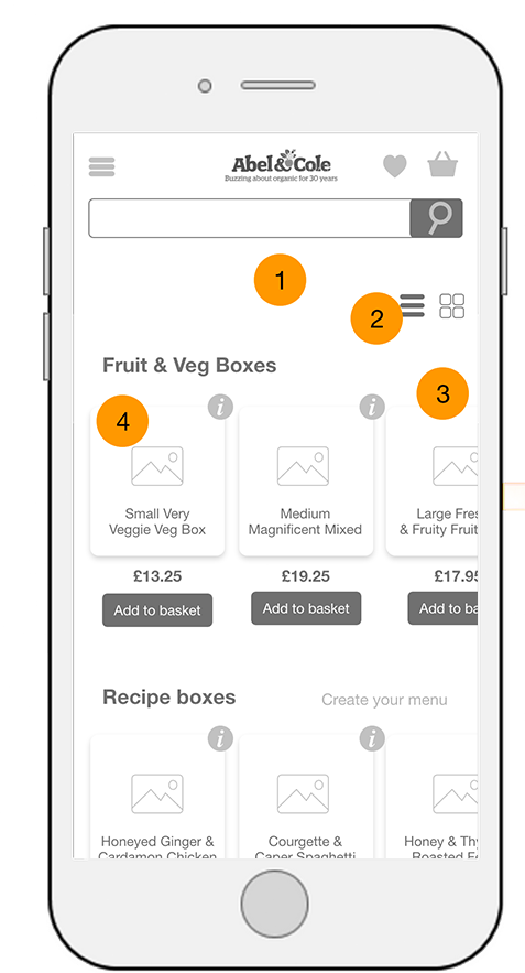
Product display page
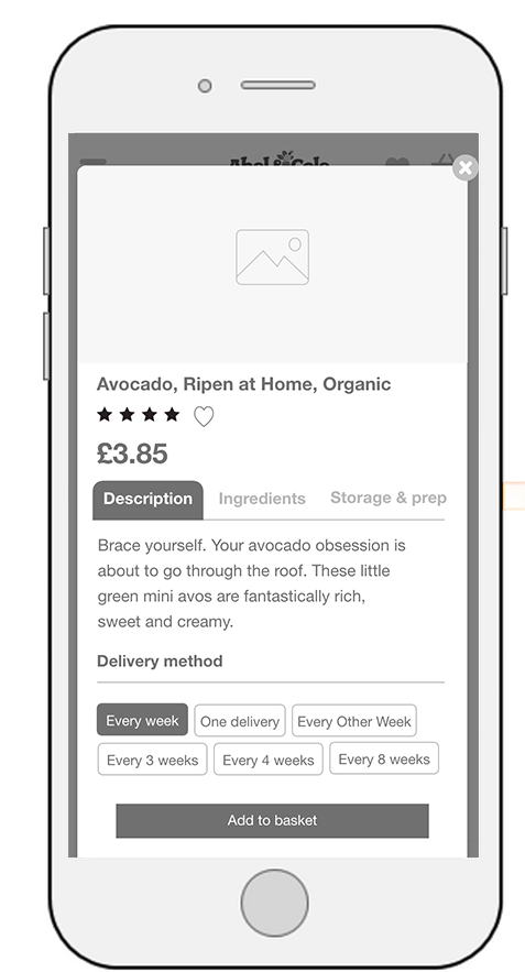
Product overlay
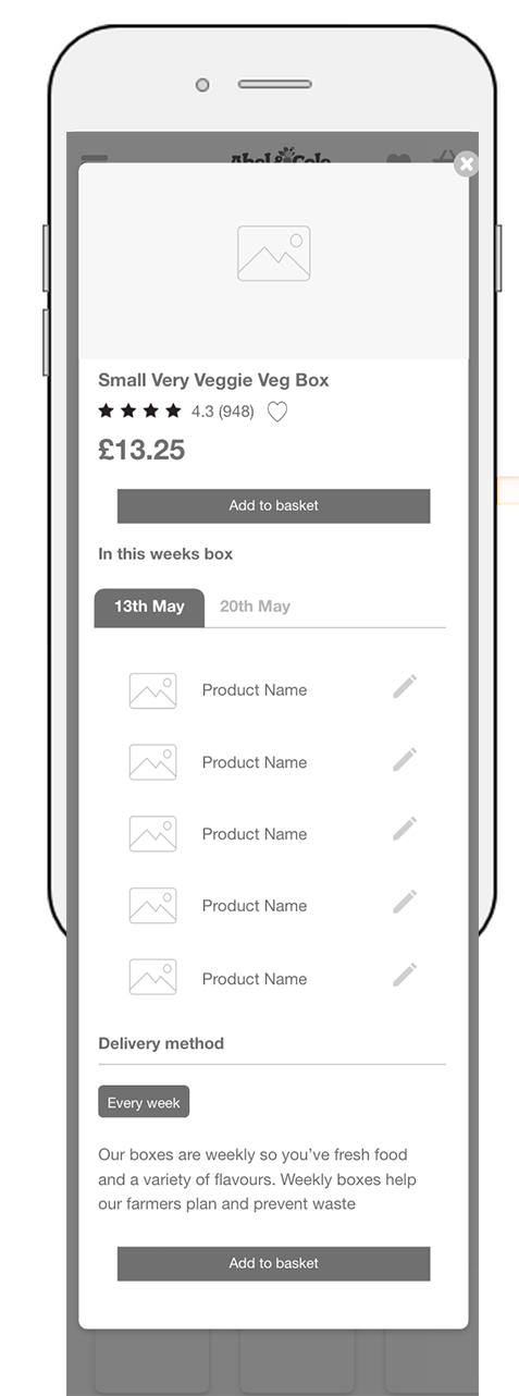
Product box overlay
Product display page
(1) We took the decision to remove the header content. Particpants were scrolling immediately pass this and navigating to the products available to them.
By removing this content, we could display more products above the fold. The decision was also informed due to the momentum that participants had from the CTA "Start My Shop" as participants pointed out how they just wanted to get on with their shop.
(2) We further introduced the ability to switch views of the page from list to grid depending on the customers preference. We included this because considering iphone 5 devices at 320px, the ability to engage with a product carousel is somewhat redundant and there is a reduction in products available on show.
(3) We increased products available to the customer that would be in view and created the product carousel for customers to navigate to.
(4) We challenged our product cards and the information contained.
Product overlay
As our product cards were becoming cluttered within the product display page, we needed to give consideration as to how / where this would information would be placed.
We gave consideration to introducing an overlay for when customers interact with the initial preview action.
The product overlay heirarchy of information is mirrored by the product details page so customers remain familiar with the structure of content.
High-fidelity designs
There are some changes from the initial wireframes which we accomodated to in the designs. The wireframes were helpful in bringing wider teams together as this reduced the design debt when we arrived at this stage. What we learnt from the designs were how ambitious this page could become for customers based on their behaviour from search to category exploration from the navigation.
By having a separate section which showcased the breadth of categories and their products, this is perhaps a lot more accessible to a user due to its low interaction required. One for us to test in the future and take away as a hypothesis of how far this page could be pushed in the right way.
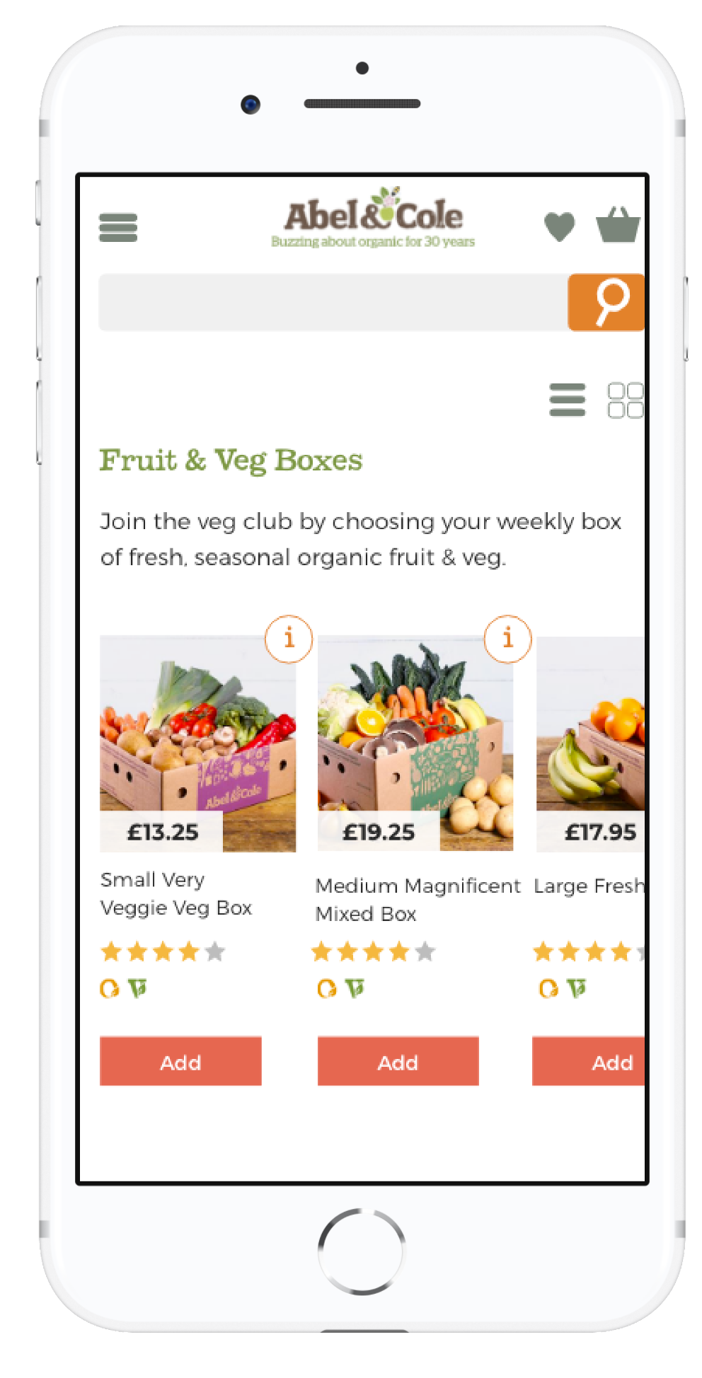
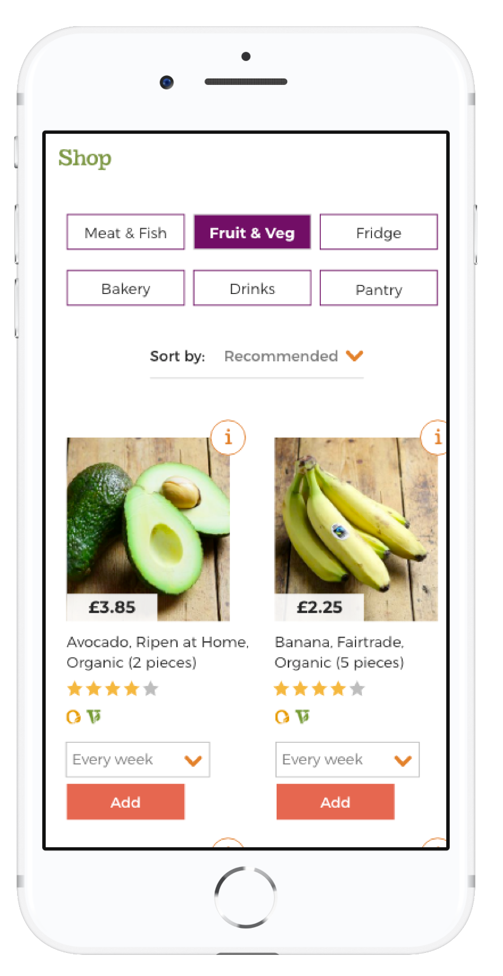
What went live?
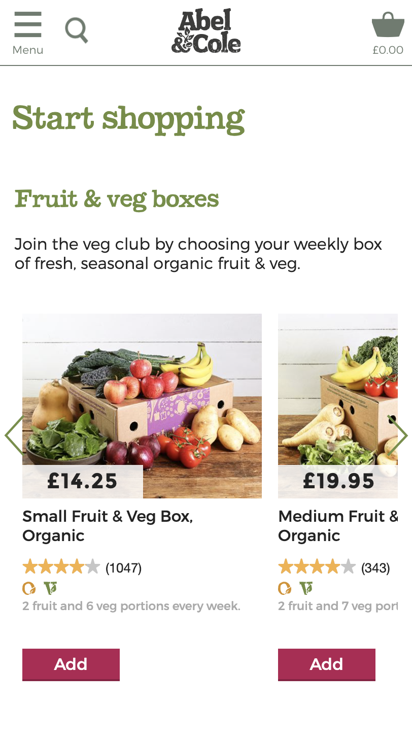
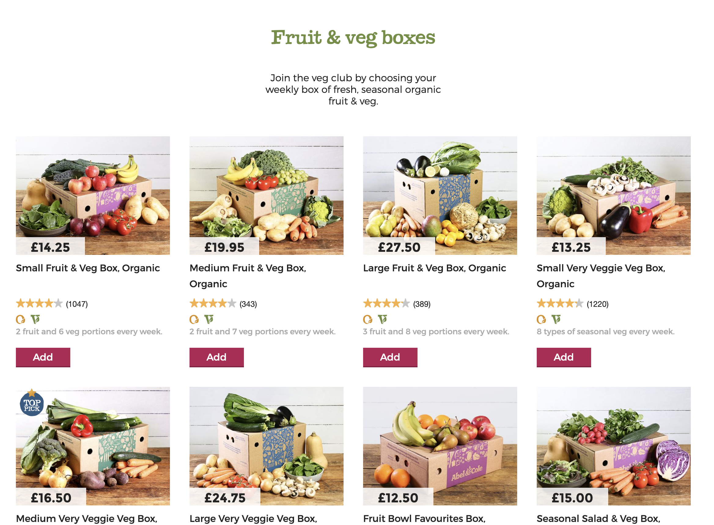
From the changes we were making to improve on what we had; components, changes in product cards, image formatting to name but a few, we needed to get to an MVP and start delivering value as soon as possible with the primary changes we were making based on the goals of this project and the insights we had.
As a scrum team, we were able to estimate effort against the user stories required and focused our attention on the usability / changes in what we were proposing for product carousel and the new shop content section.
Impact
With a mobile first approach, we were able to simplify the experience in reduction of interaction cost by presenting only the key requirements for our customers to sign up with us. The journey takes a step back as we removed the clutter surrounding what was most important to prospect customers.
a/b test results
We a/b tested the original against the variant for 4 weeks, achieving statistical significance in the following
46%
uplift on add to basket
87%
11% to 21% on add to bakset rate on mobile
96%
statstical significance on order complete CVR: 2.0% - 2.5%
Retrospective
Whilst we were able to combine the works from both the sign up experience and start my shop, there were certainly qualitative insights which we were unable to take advantage of because this required internal review and a reframed research approach. We had our leadtime and have reserved the insights for later review.
